A Guide to Next JS Image Optimization for Peak Performance
If you've worked with Next.js you've probably come across its built-in next/image component. It's more than just a wrapper for an <img> tag; it's a powerhouse designed to automate some of the trickiest parts of web performance. It smartly
If you've worked with Next.js, you've probably come across its built-in next/image component. It's more than just a wrapper for an <img> tag; it's a powerhouse designed to automate some of the trickiest parts of web performance. It smartly lazy-loads offscreen content, generates responsive srcsets, and prevents cumulative layout shift, all of which contribute to a much smoother user experience.
Why Next.js Image Optimisation Is a Game Changer
Let's be real: images are often the heaviest assets on a web page. They can single-handedly slow down your site, frustrate visitors, and tank your search engine rankings. The next/image component was built specifically to tackle this head-on, offering a suite of automatic optimisations that a standard <img> tag simply can't match.
This isn't just about making things easier for developers. It’s a core tool for acing the performance metrics that matter, especially the Core Web Vitals that Google uses to evaluate user experience. According to HTTP Archive, images make up a significant portion of a page's total weight, making their optimization critical for improving page speed.
Next.js Image Component vs. Standard <img> Tag
| Feature | Standard <img> Tag | Next.js <Image> Component |
|---|---|---|
| Responsiveness | Manual srcset required | Automatic srcset generation |
| Format Optimisation | Serves the original format only | Delivers modern formats like WebP |
| Loading | Loads immediately (eager) | Lazy-loads by default |
| Layout Shift | Can cause CLS issues | Prevents CLS by reserving space |
| Performance | Developer-dependent | Built-in performance best practices |
As you can see, the <Image> component automates several best practices that would otherwise require significant manual effort. It’s a huge leap forward for building high-performance sites.
Automatic Performance Enhancements
The real magic of next/image lies in what it does behind the scenes. You don't have to spend hours manually resizing images for every possible device or figuring out how to implement lazy loading. It just works.
Here's a breakdown of what it handles for you:
- Responsive
srcsetGeneration: It automatically creates multiple versions of an image. This lets the browser pick the perfect size based on the user's screen, so a phone doesn't download a massive desktop-sized image. - Modern Format Delivery:
next/imagecan serve images in next-gen formats like WebP. These formats offer far better compression than old-school JPEGs or PNGs, meaning smaller file sizes without losing quality. - Built-in Lazy Loading: Any image outside the initial viewport won't load until the user scrolls close to it. This simple trick saves bandwidth and makes the initial page load much faster.
- Layout Shift Prevention: By making the
widthandheightprops mandatory, the component carves out space for the image before it loads. No more content "jumping" around while the page renders, which directly improves your Cumulative Layout Shift (CLS) score.
Impact on Core Web Vitals and SEO
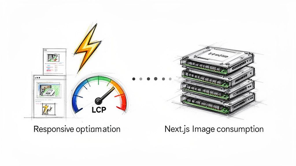
All these automated tweaks have a direct, positive impact on your site's Core Web Vitals. The biggest win is usually with Largest Contentful Paint (LCP), the metric measuring how quickly the main visual element on the page loads.
By serving smaller, optimised images and lazy-loading the non-essential ones, next/image helps the most important content appear faster, leading to a much better LCP score. A faster, more stable site isn't just good for users; search engines love it, too, which often translates to better rankings and more organic traffic. Optimizing images can significantly improve Web Core Vitals, leading to a better user experience and SEO benefits.
Combining modern formats, responsive sizing, and smart browser detection can lead to incredible bandwidth savings. This is why tools like the Next.js
Imagecomponent are so crucial for modern web performance. You can discover more about the technical foundations behind these savings and how they're achieved.
Addressing The Common Challenges
Of course, it's not a silver bullet. The default Next.js image optimisation has a catch: the resizing and processing happen on your application server, either at build time or on-demand. For sites with tons of images or dynamic content, this can create a serious server-side bottleneck.
Many developers have run into issues with high memory consumption in production, sometimes even forcing server restarts or making them disable the built-in optimiser entirely. This is precisely where external solutions come in. While next/image provides a fantastic foundation, offloading the heavy lifting to a specialised service like PixelFiddler can eliminate these performance headaches, letting your app scale smoothly without sacrificing speed or reliability.
Dialling In Your Next.js Image Configuration
To truly get the best out of the next/image component, you need to look beyond the defaults. A little bit of configuration goes a long way, especially when you're pulling images from external domains. This is where you can seriously boost performance and tighten up security.
First things first, let's talk about remotePatterns in your next.config.js file. Think of this as your security whitelist. It tells your Next.js app, "These are the only domains I trust to serve images from." If you skip this, you’re essentially leaving your image optimisation service open for anyone on the internet to use, which is a recipe for a surprisingly high bill and potential abuse.
Defining your trusted protocols and hostnames is a non-negotiable step for any production app. It’s a simple change that makes a huge difference.
Setting Up Secure Remote Patterns
Let's walk through a real-world scenario. Say your app pulls all its visuals from a dedicated media library at media.example.com. To get Next.js to play nice with it, you’d pop this into your next.config.js:
/** @type {import('next').NextConfig} */
const nextConfig = {
  images: {
    remotePatterns: [
      {
        protocol: 'https',
        hostname: 'media.example.com',
        port: '',
        pathname: '/images/**',
      },
    ],
  },
}

module.exports = nextConfig
See how specific that is? We’re only allowing images served over https from media.example.com, and even then, only if they live under the /images/ path. This kind of granular control is exactly what you want.
Mastering Essential Image Props
Beyond the main config file, the props you pass directly to the <Image> component are your frontline tools for performance. The big three are width, height, and fill, and getting them right is the key to preventing that annoying page jump as images load.
Unless you're using the fill prop, width and height are mandatory. Their job is to tell the browser to save a specific block of space for the image before it even starts downloading. This is how Next.js nails Cumulative Layout Shift (CLS), a Core Web Vital that Google cares a lot about. No more content shifting around as the page loads.
When you need an image to be more fluid and stretch to fit its container—like for a hero banner—the fill prop is your best friend. It makes the image ignore width and height, and instead, it expands to the size of its parent element. The only catch is that the parent element needs its CSS position set to relative, fixed, or absolute for this to work.
When using the
fillprop, you absolutely must define thesizesattribute. If you don't, the browser defaults to thinking the image is 100vw (100% of the viewport width), which often means it requests a much larger, heavier file than it actually needs.
The Power of the sizes Attribute
This brings us to sizes, arguably the most powerful yet commonly overlooked prop for responsive images. Its purpose is simple: give the browser hints about how big the image will actually be displayed across different screen sizes.
With this information, the browser can intelligently pick the best-fit image from the srcset that Next.js automatically generates for you. A well-crafted sizes attribute can slash image file sizes for users on mobile devices. I recently came across a great post about building a fast, SEO-optimised blog with Next.js that really drove home how powerful this is when combined with a good CDN.
Here’s what sizes looks like in practice:
<Image
  src="/hero.jpg"
  alt="A descriptive alt text"
  fill
  sizes="(max-width: 768px) 100vw, (max-width: 1200px) 50vw, 33vw"
/>
Here’s what you’re telling the browser with that one line:
- On screens 768px or smaller, this image will take up the full viewport width (100vw).
- On screens between 768px and 1200px, it'll only take up half the viewport width (50vw).
- On anything wider than 1200px, it’ll take up a third of the viewport width (33vw).
Taking the time to get these props right guarantees every user gets a stable, fast, and great-looking experience—which is a huge win for both your site's performance metrics and its SEO.
Solving Performance Bottlenecks With PixelFiddler
The built-in next/image component is a fantastic tool, but it has a potential Achilles' heel: it relies on your application server for all its optimisation magic. Every time a browser requests a new image size, your server has to spin up, burn CPU cycles, and use memory to process it. For smaller sites, this is fine. But if you’re dealing with a large image library or a spike in traffic, that on-demand processing can quickly become a serious performance drain.
Think of it this way: you're asking your main application server, which should be busy handling API requests and rendering pages, to also moonlight as a graphics editor. It’s not a sustainable model for growth. Sooner or later, something has to give.
The Server-Side Strain of Default Optimisation
This isn't just a theoretical problem. Plenty of development teams have hit a wall with Next.js's default image optimisation in production. One of the most common complaints is runaway memory consumption. You can read through some of the production horror stories and the workarounds people have cobbled together.
This operational headache forces a tough decision: either turn off the very optimisations that make the front-end experience so good, or find a way to offload the work to a service built for the job. This is exactly where a dedicated image CDN like PixelFiddler comes into the picture.
By delegating image processing to a specialised service, you let your application server focus on what it does best: serving your application's logic. It's a classic separation of concerns, a foundational principle for building scalable web apps.
PixelFiddler acts as a serverless image processing engine. It takes on all the heavy lifting—resizing, reformatting, and applying transformations in real-time—without touching your application server's resources. You get all the perks of advanced image optimisation without the performance penalty.
Integrating PixelFiddler with Your Next.js Project
Getting PixelFiddler plugged into a Next.js app is surprisingly simple, thanks to the @pixelfiddler/next SDK. It’s designed to be a drop-in replacement for the standard next/image component, so it feels familiar right out of the box while giving you a whole new level of power.
First thing's first, you'll need to install the SDK package into your project.
npm install @pixelfiddler/next
# or
pnpm add @pixelfiddler/next
# or
yarn add @pixelfiddler/next
This package gives you the PixelFiddlerImage component, which cleverly wraps the native next/image. This means you keep all the features you already rely on—automatic srcset generation, lazy loading, and CLS prevention—while seamlessly connecting to PixelFiddler’s transformation engine.
Using the PixelFiddlerImage Component
With the package installed, you can start swapping out your existing <Image> components. The process is designed to be painless. Just change the import and the component name.
Here’s a quick before-and-after:
import { PixelFiddlerImage } from '@pixelfiddler/next';

export default function Page() {
  return (
    <PixelFiddlerImage
      src="https://media.pixelfiddler.com/photos/media/hero.jpg"
      alt="Hero image"
      width={1200}
      height={600}
      transformations={{ format: 'WEBP', quality: 85 }}
    />
  );
}
See how similar that is? The src, alt, width, and height props all work just as you'd expect. The game-changer is the new transformations prop. This is where you can define any of PixelFiddler's on-the-fly manipulations right inside your component. It's a simple addition that unlocks a far more robust and scalable image workflow.
Centralising Your Configuration with a Provider
To keep your code DRY and avoid pasting your base URL everywhere, the SDK also provides a PixelFiddlerProvider. This is perfect for wrapping your application's root, whether you're using the App Router or the old Pages Router.
Setting this up in an App Router project looks like this:
app/layout.tsx
import { PixelFiddlerProvider } from '@pixelfiddler/next';

export default function RootLayout({ children }) {
  return (
    <html lang="en">
      <body>
        <PixelFiddlerProvider
          config={{
            baseUrl: process.env.NEXT_PUBLIC_PIXELFIDDLER_URL,
          }}
        >
          {children}
        </PixelFiddlerProvider>
      </body>
    </html>
  );
}
Once the baseUrl is set in the provider, you can use relative paths in the src prop for any PixelFiddlerImage component downstream. This cleans up your image components significantly and makes maintenance a breeze, especially as your application grows. This one-time setup only takes a few minutes but pays for itself by simplifying your codebase and future-proofing your image delivery strategy.
Getting Hands-On With The PixelFiddlerImage Component
Switching from the standard next/image to PixelFiddlerImage is a breeze by design. It’s essentially a drop-in replacement, so you keep all the Next.js goodness—like lazy loading and preventing Cumulative Layout Shift (CLS)—but you gain access to a powerful, serverless transformation engine.
Let's get practical and jump into the code.
Setting things up is refreshingly simple. Once you've installed the @pixelfiddler/next package, you just import PixelFiddlerImage and use it exactly like you would the native component. This familiarity means there’s virtually no learning curve, letting you tap into its advanced features right away.
Your First PixelFiddler Image Component
Getting started is as simple as changing the component name. All the props you're used to, like src, alt, width, and height, work just as you'd expect. The real magic happens with the new transformations prop.
Here’s a quick look at rendering an image, converting it to the modern WEBP format, and setting a quality level of 85.
import { PixelFiddlerImage } from '@pixelfiddler/next';

export default function ProductCard() {
  return (
    <PixelFiddlerImage
      src="https://media.pixelfiddler.com/products/item.jpg"
      alt="A detailed product image"
      width={400}
      height={300}
      transformations={{ format: 'WEBP', quality: 85 }}
    />
  );
}
With this small tweak, you’ve just offloaded all the heavy lifting—format conversion, quality adjustments—to PixelFiddler’s edge network. Your own application server is now free from that resource-intensive work, which is a huge win for performance and scalability.
Applying Powerful On-The-Fly Transformations
The transformations prop is where the fun begins. It's your control panel for a whole library of image manipulations. You can stack multiple effects in a single object, from basic tweaks to complex artistic filters, all generated on demand. This is perfect for creating different visual styles without having to save and manage multiple versions of the same file.
For instance, say you need a blurred version of a product image for a background. Instead of creating and uploading a separate file, you can just add the blur parameter on the fly.
import { PixelFiddlerImage } from '@pixelfiddler/next';

export default function HeroSection() {
  return (
    <div className="relative">
      {/* Background Image */}
      <PixelFiddlerImage
        src="/photos/hero-bg.jpg"
        alt="Abstract background"
        fill
        sizes="100vw"
        transformations={{
          blur: 15,
          quality: 70,
        }}
      />
      {/* Foreground Content */}
      <div className="relative z-10">
        {/* Your hero text and CTA */}
      </div>
    </div>
  );
}
This approach doesn't just simplify asset management; it guarantees you're always serving an optimised file. The Transformations API gives you incredible creative freedom right inside your React components.
Building Truly Responsive Images
One of the most valuable features of PixelFiddlerImage is its intelligent, automatic srcset generation. When you use the fill and sizes props together, you're telling the browser exactly how to download the perfect image for any device, which can drastically cut down on bandwidth for mobile users.
The sizes attribute is the key. It gives the browser a set of rules about how large the image will be displayed at different screen sizes, and PixelFiddler uses this info to generate a perfectly optimised srcset.
import { PixelFiddlerImage } from '@pixelfiddler/next';

export default function FullWidthBanner() {
  return (
    <PixelFiddlerImage
      src="https://media.pixelfiddler.com/photos/main-banner.jpg"
      alt="Promotional banner"
      fill
      sizes="(max-width: 768px) 100vw, (max-width: 1200px) 50vw, 800px"
      transformations={{ format: 'WEBP' }}
    />
  );
}
In this real-world scenario, a user on a small phone gets a smaller, faster-loading image, while someone on a large desktop monitor gets the high-resolution version. This level of control is fundamental for achieving a great Largest Contentful Paint (LCP) score.
Pro Tip: Wrapping your app in the
PixelFiddlerProvideris a best practice that really pays off. You define yourbaseUrljust once in your root layout, which lets you use clean, relative paths in all your image components.
Centralising Configuration With a Provider
Nobody wants to repeat the baseUrl in every single image component. That's not just tedious; it's asking for trouble. The PixelFiddlerProvider is the elegant solution, creating a shared context for all PixelFiddlerImage components inside it. Set it up once, and you're good to go.
If you're using the App Router, you'll want to add it to your app/layout.tsx:
// app/layout.tsx
import { PixelFiddlerProvider } from '@pixelfiddler/next';

export default function RootLayout({ children }) {
  return (
    <html lang="en">
      <body>
        <PixelFiddlerProvider
          config={{
            baseUrl: process.env.NEXT_PUBLIC_PIXELFIDDLER_URL,
            maxDpr: 2
          }}
        >
          {children}
        </PixelFiddlerProvider>
      </body>
    </html>
  );
}
With the provider in place, your image components suddenly get a lot cleaner. You can now use relative paths for the src prop, and the provider automatically handles prepending the baseUrl. This makes your components far more reusable and your image strategy much easier to manage.
A product grid component, for example, becomes much more concise:
import { PixelFiddlerImage } from '@pixelfiddler/next';

export default function ProductGrid({ products }) {
  return (
    <div className="grid">
      {products.map((product) => (
        <PixelFiddlerImage
          key={product.id}
          src={product.imagePath} // e.g., /images/product-123.jpg
          alt={product.name}
          width={300}
          height={300}
          transformations={{ format: 'WEBP', quality: 80 }}
        />
      ))}
    </div>
  );
}
This setup doesn’t just make development smoother; it centralises a critical piece of configuration. If you ever need to change your image source, you only have to update it in one place.
A Deeper Look at the Component's Props
While many props are familiar from next/image, there are some key additions and behaviours worth knowing. Here’s a breakdown to help you get the most out of the component.
Key PixelFiddlerImage Props Explained
| Prop | Description | Example Usage |
|---|---|---|
src | The path to your image. When using the Provider, this can be a relative path (e.g., /products/shoe.jpg). | src="/banners/summer-sale.png" |
alt | Standard alt text for accessibility and SEO. Always a must-have. | alt="A pair of red running shoes" |
fill | A boolean that makes the image expand to fill its parent container. Requires the parent to have position: relative. | fill={true} |
sizes | Used with fill to tell the browser how wide the image will be at different breakpoints. Essential for responsive images. | sizes="(max-width: 768px) 100vw, 50vw" |
transformations | The PixelFiddler-specific prop. An object where you define on-the-fly manipulations like format, quality, blur, etc. | transformations={{ format: 'AVIF', quality: 75, blur: 5 }} |
responsive | A boolean that determines if responsive srcset generation is enabled. Defaults to true. | responsive={false} |
priority | A boolean prop. When true, it tells Next.js to preload the image, which is crucial for LCP performance on above-the-fold images. | priority={true} |
Understanding these props is key to unlocking the full potential of PixelFiddlerImage, allowing you to fine-tune performance and visual delivery with precision.
Boosting Core Web Vitals And SEO With Faster Images
Let’s be honest, advanced image optimisation isn't just a box-ticking exercise for developers. It's one of the most direct ways to improve your site's user experience and, as a result, its SEO performance. Every millisecond you shave off the load time makes a real difference, and search engines like Google are watching closely through their Core Web Vitals.
When you pair a framework as powerful as Next.js with a dedicated image service like PixelFiddler, you’re not just tweaking things—you’re setting your site up to ace these critical metrics. The impact can be huge.
Directly Improving LCP and CLS
Two of the three Core Web Vitals are directly affected by how you load your images. If you get your images right, you're already most of the way there.
- Largest Contentful Paint (LCP): This metric measures how fast the main event—the largest image or text block—appears on the screen. Giant, unoptimised images are the number one culprit for poor LCP scores, leaving users staring at a blank page.
- Cumulative Layout Shift (CLS): This tracks how much your page content jumps around while loading. We've all experienced it, and it's annoying. Images without clearly defined dimensions are notorious for causing this layout shift.
Using a component like PixelFiddlerImage is designed to solve both problems. It serves up perfectly sized, next-gen images from a global network, which means your main content loads incredibly quickly. That takes care of LCP. At the same time, it builds on the Next.js Image component’s requirement for width and height attributes (or fill and sizes), which tells the browser to save the right amount of space from the start. The result? A rock-solid layout and a near-zero CLS score.
A fast, visually stable website isn't just a "nice-to-have"—it's a fundamental requirement for ranking well. Search engines reward sites that provide a seamless user experience, which often translates into better visibility and more organic traffic.
The Tangible Impact of Reduced Image Payloads
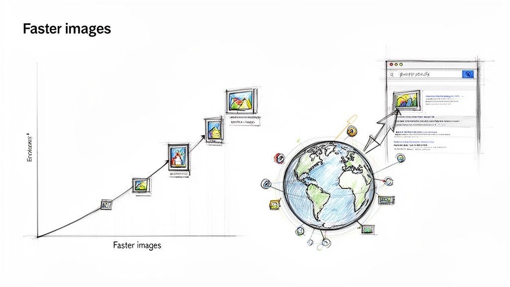
Shrinking the total file size of your images creates a positive domino effect. Smaller files mean faster downloads, which directly translates to quicker page loads—a massive ranking factor. This isn't just a minor improvement; the performance gains can be staggering.
For instance, I've seen real-world Next.js projects achieve incredible results. One mid-sized marketing site managed to slash its total image payload by 60%, dropping from 3 MB to a lean 1.2 MB. This single change led to a massive 1.3-second reduction in its Largest Contentful Paint, bringing it from 2.5 seconds down to a blistering 1.2 seconds. You can dig deeper into how these optimisations lead to blazing-fast loading times.
Gaining a Competitive Edge with Global Delivery
This is where a service like PixelFiddler really shines. Its global edge network caches your optimised images in data centres all over the world. This means every user, whether they're in London or Sydney, gets served images from the server closest to them. Latency plummets, and delivery speeds go way up.
This global distribution keeps your site snappy and responsive for an international audience, giving you a clear advantage over competitors. When your next js image components are backed by an intelligent delivery network, you're not just optimising files; you're optimising the entire user journey. This is how you build a site that not only ranks well but also keeps users engaged.
Got Questions About Next.js Images? We've Got Answers.
When you start pulling in a service like PixelFiddler to handle your Next.js images, a few common questions tend to pop up. Let's tackle some of the most frequent ones I hear from developers.
How Does PixelFiddler Impact SEO?
In a good way. Search engines are obsessed with speed and user experience, and images are a huge part of that. By letting PixelFiddler handle the heavy lifting, you’re not just taking a load off your server; you’re tapping into a global CDN. This means faster image delivery for everyone, everywhere.
This has a direct, positive effect on your Largest Contentful Paint (LCP), one of Google's Core Web Vitals. On top of that, PixelFiddlerImage is built right on top of next/image, so you get all the fantastic, out-of-the-box protection against Cumulative Layout Shift (CLS). Better LCP and CLS scores are exactly what search engines love to see.
What’s the Best Way to Handle Cache Invalidation?
This is a classic problem. You've updated an image in your storage, but the CDN keeps serving the old, cached version because the filename is the same. PixelFiddler gives you a couple of easy ways to handle this. You can manually purge the cache right from the PixelFiddler dashboard or trigger it via their API.
A more automated approach, especially for images that change often, is to add a version number or a timestamp to the image src as a query parameter (e.g., ?v=2). This little trick makes the URL unique, forcing the CDN to pull the fresh version without you needing to do a thing.
What if I Need an Image That Isn't Responsive?
It's a common scenario. While generating a full srcset is great for hero images, you don't need it for a small, fixed-size logo or an icon. The PixelFiddlerImage component has you covered.
Simply add the responsive prop and set it to false. This tells the component to skip generating all the different sizes and just serve the one specific image defined by your width and height props.
<PixelFiddlerImage
  src="/icons/logo.svg"
  alt="Company Logo"
  width={150}
  height={40}
  responsive={false}
/>
Ready to stop server-side bottlenecks and deliver perfectly optimised images every time?

PixelFiddler integrates seamlessly with your Next.js workflow, offloading all the heavy lifting to a powerful, global edge network. Get started for free and see the performance difference.