A Practical Guide to CSS Center Image Techniques
Staring at an image that’s just slightly off-centre can be infuriating. It’s the kind of small detail that can make an entire design feel unprofessional. The good news is that modern CSS gives us powerful, reliable ways to fix this. For quick horizontal centring, display: flex with justify-content: center is a go-to. If you need perfect horizontal
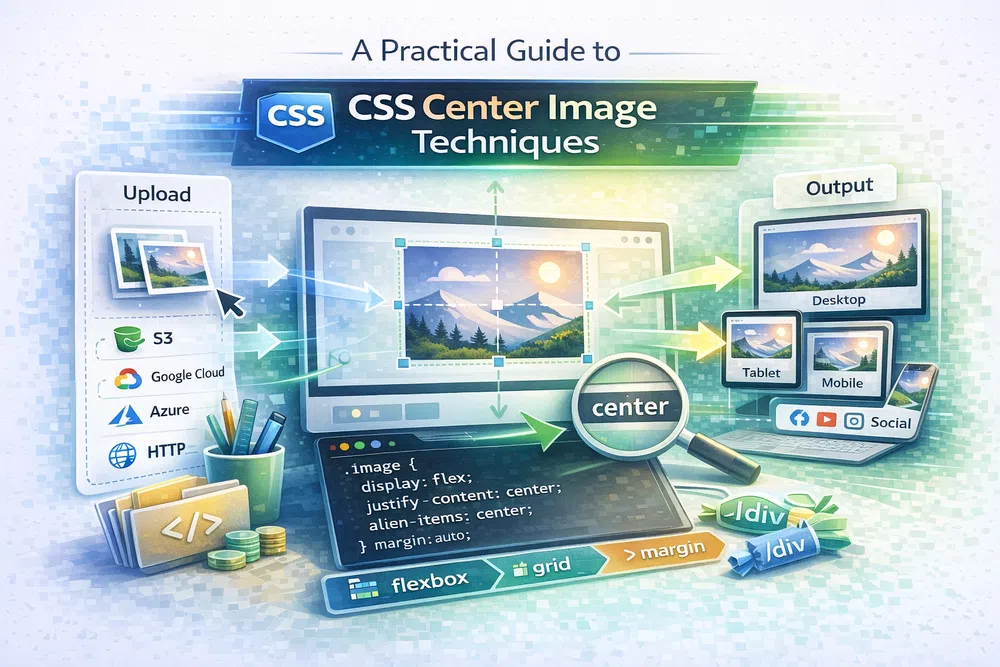
Staring at an image that’s just slightly off-centre can be infuriating. It’s the kind of small detail that can make an entire design feel unprofessional. The good news is that modern CSS gives us powerful, reliable ways to fix this. For quick horizontal centring, display: flex with justify-content: center is a go-to. If you need perfect horizontal and vertical alignment, display: grid with place-items: center is your best friend.
Why Mastering Image Centring Still Matters
Centring an image might sound like CSS 101, but it’s a foundational skill that separates amateur layouts from professional, polished designs. Good alignment isn't just about making things look tidy; it’s a core design principle that heavily influences the user experience. When elements are properly centred, they create a natural sense of order and calm, directing the user's eye right where you want it.

Think about the real-world impact. A well-centred hero image immediately establishes a strong focal point for a homepage. A product gallery with every image perfectly aligned feels more organised and trustworthy to a potential customer. This is where code meets design theory.
The Evolution from Clunky Hacks to Clean Code
Thankfully, we've moved past the dark ages of using fragile table layouts or fiddly negative margin tricks to force things into place. CSS has grown up, and the old, clunky methods are now obsolete. Today, we have several elegant solutions for this common challenge:
- Flexbox: This one-dimensional layout model is brilliant for aligning items along a single axis. It’s my first choice for most horizontal centring tasks.
- Grid: As a two-dimensional system, Grid makes it almost trivial to centre something both horizontally and vertically at the same time.
- Classic Methods: Old-school techniques like
margin: autohaven't disappeared. They still have their place and work perfectly for centring block-level elements like an<img>inside a<div>.
Learning these modern techniques does more than just clean up your stylesheet. It makes your layouts more robust, responsive, and far easier to maintain. It’s about knowing you have the right tool for any design problem, which lets you build with confidence.
By getting a handle on the different ways to CSS centre image elements, you'll be able to create layouts that are not just functional but also visually compelling. This guide will walk you through each method, from the tried-and-true classics to the modern workhorses.
A Look at the Classic Centering Methods
Before Flexbox and Grid became our go-to layout tools, we had to get a bit more creative to centre things. These classic techniques are still incredibly useful, and honestly, sometimes they're the simplest and best tool for the job. Knowing them gives you a deeper understanding of how CSS works and adds some reliable tricks to your arsenal.
The fact that CSS is used by 95.7% of all websites really speaks volumes about its power. It’s the backbone of web design, so mastering its quirks and capabilities, both old and new, is a must for any serious developer. If you're curious, you can find more stats on CSS usage at W3Techs.

The Simple text-align Method
Let's start with the most straightforward trick in the book: text-align: center. This property is designed to align any inline content—like text or, in our case, an image—within its parent element.
Just wrap your image in a <div> or another container and apply the style directly to the parent. It’s that easy.
<div class="image-container">
  <img src="https://media.pixel-fiddler.com/my-source/media/my-image.jpg" alt="A sample image being centred with text-align">
</div>
.image-container {
text-align: center;
}This is my go-to for a quick horizontal fix. Keep in mind, though, it won’t do a thing for vertical alignment.
Margin: auto — The Workhorse for Block Elements
Ah, margin: 0 auto. This is probably the most famous CSS centering technique of all time. It’s the classic solution for horizontally centering any block-level element. Since an <img> tag is an inline element by default, we just need to give it a little nudge.
For this magic to happen, a couple of things need to be true:
- The element needs
display: block. - The element must have a specific
width.
If you don't set a width, the browser has no idea how to calculate the "auto" margins needed to perfectly centre the element. It needs that boundary to work against.
<img class="block-image" src="https://media.pixel-fiddler.com/my-source/media/my-image.jpg" alt="A sample image being centred with margin auto">.block-image {
display: block;
width: 80%; /* Or a fixed value like 400px */
margin: 0 auto;
}This method is rock-solid, has fantastic browser support, and is perfect for centering main content blocks or standalone images horizontally.
Absolute Positioning and transform
What if you need to centre an image both horizontally and vertically? Before Flexbox, this was the clever way to do it. Combining absolute positioning with the transform property gives you precise control.
This technique works by first moving the image's top-left corner to the dead centre of its parent container.
The real trick is the
transform: translate(-50%, -50%)part. This pulls the image back up by half its own height and left by half its own width. The result? The image's centre is now perfectly aligned with the container's centre.
Here’s the setup:
<div class="parent-container">
  <img class="absolute-center" src="https://media.pixel-fiddler.com/my-source/media/my-image.jpg" alt="A sample image being centred with absolute positioning">
</div>
.parent-container {
position: relative; /* This is crucial for the positioning context! */
height: 400px; /* The parent needs defined dimensions */
}
.absolute-center {
position: absolute;
top: 50%;
left: 50%;
transform: translate(-50%, -50%);
}I love this method for things like hero image text, modal pop-ups, or any element that needs to be perfectly centered inside another, regardless of its own size.
Modern Centering with Flexbox and Grid
While the old-school methods still have their uses, the game completely changed when CSS Flexbox and Grid came along. These modern layout systems turned what used to be tricky alignment puzzles into simple, one-line declarations. If you need a reliable and straightforward way to centre an image today, these two are your best friends.

They give us a far more intuitive box model that makes positioning things inside a container almost effortless. You can forget about wrestling with floats or finicky positioning hacks. Flexbox and Grid do the heavy lifting for you, leading to layouts that are both robust and much easier to manage.
Centering with Flexbox
Flexbox was built for one-dimensional layouts—think items in a single row or a single column. This focus makes it incredibly good at aligning elements along one axis at a time. To get an image perfectly centred both horizontally and vertically, you just need three key properties on its parent container.
First, you tell the parent to behave like a flex container with display: flex;. Then, you use justify-content: center; to handle the main axis (which is horizontal by default) and align-items: center; to sort out the cross axis (vertical).
Here’s what that looks like in your code:
.flex-container {
  display: flex;
  justify-content: center;
  align-items: center;
  height: 300px; /* Remember, the container needs a height for vertical centering to work! */
  border: 2px dashed #ccc;
}<div class="flex-container">
<img src="https://media.pixel-fiddler.com/my-source/media/my-image.jpg" alt="A perfectly centered image using CSS Flexbox">
</div>Honestly, this is my go-to for centering logos in headers or icons next to text. It's clean, predictable, and has fantastic browser support.
The Power of CSS Grid
If Flexbox is a precision tool for single-axis alignment, then CSS Grid is the powerhouse for managing two-dimensional space. While it’s known for creating complex page layouts, it also happens to offer what is arguably the simplest way to centre anything. Period.
Just set display: grid; on the parent, and you unlock its alignment superpowers. The real magic, though, is the place-items property. It's a shorthand that controls both align-items and justify-items at the same time.
By setting
place-items: center;, you're telling the browser to centre the grid item (your image) along both the horizontal and vertical axes in one go. It’s a single line that does the work of two in Flexbox.
This is all you need:
.grid-container {
  display: grid;
  place-items: center;
  height: 300px; /* Like with flexbox, the container needs a defined height. */
  border: 2px dashed #ccc;
}<div class="grid-container">
<img src="https://media.pixel-fiddler.com/my-source/media/my-image.jpg" alt="A perfectly centered image using CSS Grid">
</div>It’s incredibly concise. This approach is fantastic for hero sections, perfectly aligned card layouts, or any time you need an element right in the middle of its parent.
For more complex scenarios like image galleries or product sliders, you might want to check out our guide on building a responsive React image carousel, where these modern centering techniques are often fundamental. Both Flexbox and Grid are inherently responsive, ensuring your centred images look great everywhere, from a tiny phone screen to a massive desktop monitor.
How to Centre CSS Background Images
Centring isn't just for <img> tags. Let's be honest, background images are the workhorses of modern web design. They power the immersive hero sections and vibrant banners that grab a user's attention right away. But getting them positioned just right is crucial for a polished look, and that's where CSS background properties come into play.
A background image isn't part of the content like a standard image; it's part of an element's styling. This distinction means we need a different toolkit. Our primary tool here is the background-position property, which gives us fantastic control over where the image sits inside its container.

Using Keywords for Simple Centring
The most straightforward way to centre a background image is with the simple center keyword. You can use it once for both axes or specify center center for clarity. It does exactly what you'd expect.
Let's look at a classic hero section. We want the background image to stay perfectly centred, regardless of the screen size. We'll also add background-repeat: no-repeat; to stop it from tiling, which is the default behaviour.
.hero-section {
  background-image: url('https://media.pixel-fiddler.com/my-source/media/my-image.jpg');
  background-position: center center;
  background-repeat: no-repeat;
  height: 50vh; /* Make sure the container has some height! */
}
This simple bit of code tells the browser to align the image's centre point with the container's centre point. Easy.
Pairing Position with Background Size
But just positioning the image is only half the battle. To create backgrounds that look great on any device, you absolutely have to pair background-position with background-size. These two properties are a dynamic duo, working together to make your images scale beautifully without weird cropping or distortion.
You'll find yourself reaching for two key values most of the time:
background-size: cover;: This makes the image as large as it needs to be to completely fill the container. The trade-off is that some parts of the image might get cropped off the sides or top and bottom. It's perfect for those seamless, full-bleed hero images where the overall vibe is more important than seeing every last pixel.background-size: contain;: This scales the image to be as large as possible while keeping the entire image visible inside the container. If the image's aspect ratio doesn't match the container, you might get some empty space. This is my go-to for logos or specific graphics that must be shown in their entirety.
Here’s how they look together in a typical hero banner setup:
.hero-banner {
  background-image: url('https://media.pixel-fiddler.com/my-source/media/my-image.jpg');
  background-position: center;
  background-repeat: no-repeat;
  background-size: cover; /* This makes the image fill the space */
  color: white;
  text-align: center;
  padding: 100px 20px;
}
The combination of
background-position: centerandbackground-size: coveris a rock-solid foundation for responsive design. It guarantees that the most important, central part of your image remains the focal point, even as the browser window shrinks and grows. For a deeper dive into all the possibilities, check out our complete CSS background image guide.
How Centring Affects Performance and Core Web Vitals
A perfectly centred image is great, but if it takes forever to load, the aesthetic victory is lost. The way you handle your images has a much bigger impact on your site's performance—and your SEO rankings—than how you align them. Getting your CSS centre image technique right is a design choice, but delivering that image efficiently is a performance requirement.
Large, unoptimised images are one of the main reasons pages load slowly. This directly impacts your Core Web Vitals, especially the Largest Contentful Paint (LCP). LCP is just a fancy term for how long it takes for the biggest thing on the screen (usually a hero image) to show up. A slow LCP tells Google your page is sluggish, which can hurt your search rankings. You can boost your page speed and improve these vital metrics by focusing on faster image delivery.
Optimisation Comes First, Always
Before you even think about alignment, you need to focus on image optimisation. A smaller file means a faster download, a quicker render time, and a much happier LCP score. This is where modern image formats and smart compression really shine.
- Next-Gen Formats: Ditch the old JPEGs and PNGs where you can. Serving images in formats like WebP or AVIF can slash file sizes without any obvious drop in quality.
- Intelligent Compression: Applying the right amount of compression strips out unnecessary data from image files, making them significantly lighter and faster to load.
According to data from Google, pages loading within two seconds have an average bounce rate of just 9%. But if that load time increases to five seconds, the bounce rate skyrockets to 38%. Every millisecond counts, and optimising your images is the low-hanging fruit for improving load times.
If you want to get into the nitty-gritty of these metrics, this guide on mastering First Contentful Paint offers some great insights into what users see first.
Automate to Keep Things Fast at Scale
Manually optimising every single image just isn't practical. For any site with more than a handful of pages, automation is the only way to go. This is where tools that handle the heavy lifting for you become invaluable.
Pixel-Fiddler’s tools, for instance, are built to take this entire workflow off your plate. You can easily compress your images to find that sweet spot between quality and file size. Better yet, you can instantly convert images to WebP to serve up modern formats. By automating this, you ensure every beautifully centred image is also perfectly optimised, giving your users a snappy experience that both they and the search engines will love.
Frequently Asked Questions About Centering Images
Even with modern tools like Flexbox and Grid at our fingertips, some centering scenarios can still be a real head-scratcher. Let's tackle some of the most common questions and troubleshooting snags that pop up when you're trying to get an image perfectly centered with CSS.
Why Is Margin 0 Auto Not Centering My Image?
Ah, the classic. We've all been there. The margin: 0 auto trick is a workhorse, but it's got a couple of hard rules that are easy to forget. It only works on block-level elements that have a defined width.
By default, an <img> tag is an inline element. So, your first step is to tell the browser to treat it like a block by setting display: block;. The second crucial piece is giving the image a width (like width: 80%; or width: 500px;) that’s smaller than its parent container. Without these two declarations, the browser can't figure out how to calculate the "auto" margins needed to push it into the centre.
What Is The Easiest Way to Center an Image Vertically and Horizontally?
For modern web development, the simplest and most robust solutions are hands-down Flexbox and Grid. They just take the guesswork out of the equation.
- For CSS Grid: Just apply
display: grid;and the shorthandplace-items: center;to the parent container. Seriously, that's it. One line handles everything. - For CSS Flexbox: On the parent, you'll use a trio of properties:
display: flex;,justify-content: center;(for the horizontal axis), andalign-items: center;(for the vertical axis).
Both are fantastic, but you can't beat the simplicity of Grid's place-items property. It's arguably the most concise way to achieve perfect two-axis centering today.
How Do I Center an Image Inside a Div?
This is probably one of the most common tasks we face. For this, I almost always reach for Flexbox. Turning the parent div into a flex container gives you incredible control over whatever is inside.
The most direct method is to set display: flex;, justify-content: center;, and align-items: center; on the div itself. This will perfectly centre your <img> tag right in the middle, both horizontally and vertically. Of course, if you only need horizontal centering, the old margin: 0 auto trick (after setting display: block on the image) is still a perfectly good option.
Key Takeaway: Remember, the CSS method you choose for alignment is purely presentational. It has no direct impact on SEO or accessibility. What really matters for those is your semantic HTML and the optimisation of the image file itself.
Does the Centering Method Affect SEO or Accessibility?
Generally speaking, no. Search engines and screen readers care about the content and structure of your HTML, not your CSS styling choices.
For accessibility, the single most important thing you can do is provide a descriptive alt attribute for every <img> tag. This is the text a screen reader will announce to a user who can't see the image.
When it comes to SEO, the game is all about page speed and performance. A beautifully centered image that’s a massive file size will hurt your Core Web Vitals. The centering technique itself is invisible to search engine crawlers, but the image's file size and how long it takes to load definitely are not.
Optimising your images is every bit as important as positioning them correctly. With Pixel-Fiddler, you can automate compression and format conversion, ensuring your perfectly centered images are also lightning-fast. Learn more and start optimising for free at Pixel-Fiddler.