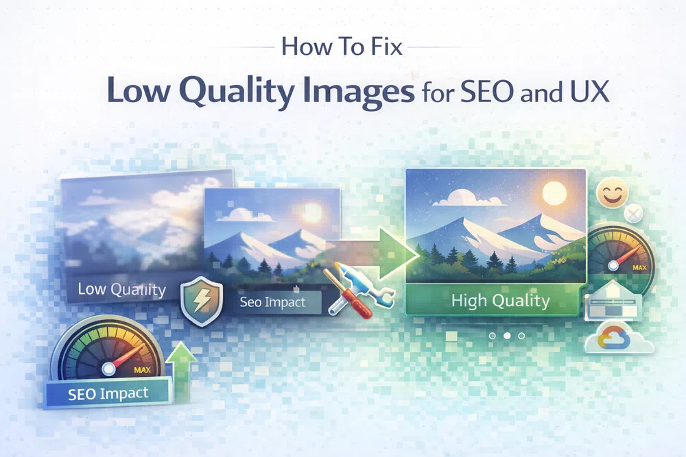
How To Fix Low Quality Images for SEO and UX
Low-quality images aren't just an eyesore; they're a silent killer for your website's performance and credibility. This isn't just about blurry or pixelated visuals. It also covers images that are way too large, slowing everything down, or saved in the wrong format, which wrecks the user experience. These problems actively drive people away, tanking your traffic and sales.
Low-quality images aren't just an eyesore; they're a silent killer for your website's performance and credibility. This isn't just about blurry or pixelated visuals. It also covers images that are way too large, slowing everything down, or saved in the wrong format, which wrecks the user experience. These problems actively drive people away, tanking your traffic and sales.
Why Low-Quality Images Are Holding Your Website Back
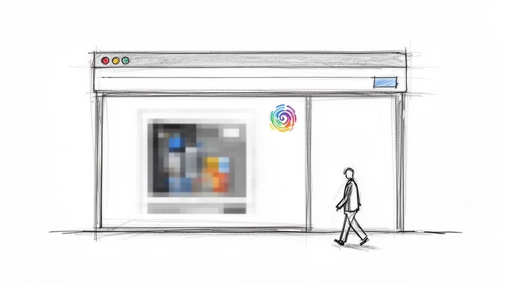
Picture your website's images as its shop window. If the display is fuzzy, distorted, or takes an age to appear, potential customers are going to walk right on by. It’s the exact same online. Poor images create a frustrating experience that can seriously sabotage your website's success.
This isn't just a vague idea—it causes real, measurable damage to your most important metrics. Every single visitor who gives up and leaves because of a bad visual experience is a lost opportunity.
To see the real-world impact, let's compare a site struggling with poor visuals to one that's properly optimised. The difference is stark.
Impact of Poor vs Optimised Images
| Metric | Impact of Low-Quality Images | Impact of Optimised Images |
|---|---|---|
| User Experience | Frustrating, slow, and unprofessional feel. | Fast, seamless, and engaging experience. |
| Bounce Rate | Significantly higher as users leave before the page loads. | Lower, as users stay to interact with content. |
| Conversion Rate | Lower, due to lost trust and poor engagement. | Higher, as a professional look builds confidence. |
| SEO Ranking | Penalised by search engines for slow speeds (poor Core Web Vitals). | Rewarded with better rankings for excellent performance. |
| Brand Perception | Seen as untrustworthy, outdated, or neglected. | Perceived as professional, modern, and reliable. |
As the table shows, getting your images right is a strategic move that pays dividends across the board, from user happiness to your bottom line.
The High Cost of a Poor Visual Experience
The link between image quality and user satisfaction is incredibly strong. When images are slow, blurry, or simply broken, people see the entire site as unprofessional and untrustworthy. That first impression is tough to shake.
Visual appeal is a huge part of why someone decides to stick around. Research from Pinterest confirms that users react far more positively to content that looks good, which leads to better feelings and meaningful actions like saving and sharing. It’s clear that focusing on visual quality is a must for building real, long-term engagement.
Here’s exactly how these issues play out:
- Increased Bounce Rates: People have zero patience. If your page, especially the main visual content, takes too long to show up, they are far more likely to hit the "back" button without a second thought.
- Lower User Engagement: A smooth visual experience invites users to click around and explore. Bad images break that flow, leading to less time spent on your site and fewer interactions.
- Damaged Brand Perception: A website with sloppy images feels like a messy, disorganised shop. It signals neglect and makes people lose trust in your brand.
Hurting Your Search Engine Rankings
Beyond frustrating your users, low-quality images actively harm your SEO. Search engines like Google want to show their users the best possible results, and that means prioritising sites that are fast and provide a great experience. They measure this using a set of metrics called Core Web Vitals. Optimizing images is a critical step in improving web core vitals and page speed.
A slow-loading page doesn't just annoy users; it sends a strong negative signal to search engines. Google's own data reveals that as page load time increases from one to three seconds, the probability of a visitor bouncing increases by 32%. (Source: Google/SOASTA Research, 2017)
Huge, unoptimised images are one of the main reasons for poor Core Web Vitals scores. They drastically slow down the Largest Contentful Paint (LCP), a key metric that measures how quickly the main content on a page becomes visible. A slow LCP tells search engines that your site offers a poor experience, and your rankings can suffer as a result. To dig deeper, check out our guide to mastering First Contentful Paint, which is another critical speed metric.
Diagnosing the Cause of Your Poor Images
Before you can fix low-quality images, you need to play detective. Pinpointing the exact reason your visuals look unprofessional is the first step towards a faster, sharper website. Often, the problem boils down to just a few common culprits that wreak havoc on image quality long before a visitor ever sees them.
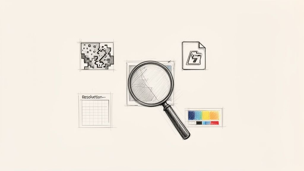
If you can get to the root of these issues, you can apply the right fix. This ensures your images are not only beautiful but also performant. Let’s break down the four most common reasons your images might be letting you down.
Aggressive and Incorrect Compression
Everyone wants smaller file sizes for faster loading, but there's a fine line between efficient and destructive compression. This process works by removing redundant data from an image file, and it comes in two main flavours: lossless and lossy.
Lossless compression is a bit like vacuum-packing your clothes; it makes the package smaller without actually changing what’s inside. When you "unzip" the image, it's identical to the original. Lossy compression, on the other hand, is more like trimming away spare fabric to save space—it permanently removes data it decides is non-essential.
The problem starts when lossy compression is applied too aggressively. This is what creates those ugly visual distortions known as compression artefacts.
- Banding: Smooth gradients, like a clear blue sky, suddenly develop distinct, blocky bands of colour.
- Blocking: The image starts to look like a mosaic of blurry squares, which is especially noticeable in detailed areas.
- Ringing: High-contrast edges, like text on a background, get a strange halo or "ghosting" effect around them.
Over-compression is a classic case of sacrificing too much for speed. A study on user perception by Pinterest found that visual appeal is a massive driver of engagement. When you push compression too far, you save a few kilobytes at the expense of the very thing that keeps users interested.
Using a smart tool that can balance quality and file size is key. For example, our free image compression tool intelligently shrinks files while preserving visual clarity.
Using the Wrong Image Format
Not all image formats are created equal, and choosing the wrong one for the job is a guaranteed way to get a poor result. Using a JPG for a logo or a PNG for a vibrant photograph often leads to either fuzzy quality or a monstrously large file size.
Each format has a specific purpose. JPG is brilliant for photos with millions of colours, but it struggles with sharp lines and transparency. PNG is the opposite; it excels at graphics with sharp edges and transparency but creates huge files for complex photos. For a more detailed look, check out our guide on PNG vs JPG.
Modern web development is increasingly moving toward next-gen formats like WebP and AVIF. These formats offer far better compression and quality than their older counterparts. They can reduce file sizes by 25-50% or more without a noticeable drop in quality, which directly improves your page speed and Core Web Vitals. You can easily see the difference by converting your images with our PNG to WebP or PNG to AVIF converters.
Resolution and Sizing Mismatches
Another common pitfall is serving an image that's the wrong size for the space it fills on the page. This problem usually shows up in one of two ways:
- Upscaling a Small Image: If you upload a small image (say, 300px wide) and then use CSS to stretch it to fill a larger container (like 800px wide), the browser has to invent pixels to fill the gaps. The result is that classic blurry, pixelated mess.
- Downscaling a Huge Image: On the flip side, uploading a massive 4000px image and shrinking it with CSS to fit a 400px container is a huge waste of bandwidth. The user is forced to download a giant file, only for their browser to throw away 90% of the pixels. This absolutely kills page load times.
The goal is to deliver an image with dimensions that closely match the display size on the user's device. This is especially important for high-density "Retina" screens, which need higher-resolution images to look sharp.
Inconsistent Colour Profiles
Have you ever noticed an image looking vibrant in your photo editor but strangely dull and washed-out on your website? This is almost always due to a colour profile mismatch. A colour profile is a small set of data that tells devices how to display colours consistently.
Most web browsers use the sRGB colour profile by default. If your image is saved with a different profile (like Adobe RGB or ProPhoto RGB), the browser won't know how to interpret the colours correctly, leading to a noticeable shift in hue and saturation. Making sure your images are saved with the sRGB profile is a simple but crucial step for getting reliable, consistent visual quality.
How Bad Images Directly Hurt Your SEO Rankings
Let's be clear: the connection between your website’s images and its Google ranking isn't some vague theory. It’s a direct relationship measured by cold, hard data. Low-quality images, especially those with bloated file sizes, act like an anchor on your site's performance, dragging down the very metrics search engines use to decide where you show up.
This goes way beyond just looking pretty. Search engines are obsessed with user experience, and a slow, clunky website is the digital equivalent of a slammed door. When your visuals aren't optimised, they're actively sabotaging your site's technical health.
The Devastating Impact on Core Web Vitals
Google’s Core Web Vitals are a specific set of metrics it uses to judge a page’s user experience. And guess what? Large, poorly handled images are one of the main reasons websites fail these critical tests, which directly torpedoes their SEO.
Two metrics get hit the hardest:
- Largest Contentful Paint (LCP): This simply measures how long it takes for the biggest visual element on the screen (usually an image) to appear. Oversized images send LCP times through the roof, forcing users to stare at a blank or half-finished page. A slow LCP is a powerful red flag for Google, screaming "frustrating user experience!"
- Cumulative Layout Shift (CLS): Ever tried to click a button, only for the entire page to jump as a late-loading image shoves everything else down? That’s CLS. It happens when images are served without proper dimensions, causing the layout to unexpectedly shift. High CLS scores are a direct penalty because they create a disruptive and genuinely annoying experience for visitors.
Sorting out your images is one of the quickest wins for improving these scores. If you want to get a head start, our guide on the differences between PNG vs JPG is a great place to understand which format to use and when.
How Page Speed Kills Your Rankings
The damage from slow-loading images doesn't stop with Core Web Vitals. Every single second a user has to wait for your page to load dramatically increases the chance they'll just give up and leave. This is tracked as your bounce rate, and a high bounce rate tells search engines that your page isn’t giving people what they came for.
Google's own research found a shocking link between load time and users leaving. As a page load time goes from just 1 second to 3 seconds, the probability of a visitor bouncing skyrockets by 32%. If that wait stretches to 5 seconds, the bounce probability jumps by a staggering 90%. You can dig into these page load time findings on Think with Google.
This isn't just about one lost visitor; it's a negative vote for your page in Google's eyes. When people consistently bounce from your site, your rankings will almost certainly fall because the search engine concludes your content isn't relevant or accessible enough.
Reduced Dwell Time and User Engagement
Even if a user patiently waits through a slow load, a poor visual experience keeps hurting your SEO. Blurry, pixelated, or just plain bad images make your content feel unprofessional and far less engaging. This leads to lower dwell time—the amount of time someone actually spends on your page before heading back to the search results.
Search engines see a short dwell time as a sign that your content completely missed the mark. When visitors don't stick around, don't click on other links, and don't interact with what you'vepublished, it signals a massive lack of value.
Ultimately, high-quality, fast-loading images are non-negotiable for keeping users engaged. They encourage people to actually read your content, explore your site, and spend more time with your brand—all of which are positive signals that boost your SEO authority. Ignoring your images means ignoring a critical piece of modern technical SEO.
A Practical Guide to Fixing Low-Quality Images
It's time to turn your website's images from a performance headache into one of your strongest assets. You can solve the most common causes of low-quality images and seriously improve your user experience by focusing on just a few key areas: choosing the right format, delivering responsive sizes, and loading them intelligently.
This isn't about some massive, complicated technical overhaul. It’s all about making smarter, more deliberate choices that lead to faster load times, sharper visuals, and better SEO rankings. Let’s walk through the most effective solutions you can put into action today.
Choosing the Right Modern Image Format
Your first move should be to ditch outdated formats and pick the right tool for the job. Switching to a modern image format is one of the single most impactful changes you can make. It gives you far better compression and quality, which directly boosts your page speed and Core Web Vitals.
Here’s a simple way to think about it:
- For Photographs and Complex Graphics: Go with WebP or AVIF. These next-gen formats produce significantly smaller files than old-school JPGs at the same level of visual quality. That means faster loading without losing the crisp details in your photos. If you're curious, we have a detailed guide on converting from PNG to AVIF that dives deeper into the process.
- For Logos, Icons, and Simple Illustrations: SVG (Scalable Vector Graphics) is your best friend. Because SVGs are built with vectors instead of pixels, they scale infinitely and stay perfectly sharp on any screen, from a tiny phone to a huge 4K monitor. Plus, their file sizes are incredibly small.
- For Graphics Requiring Transparency: When you need a transparent background and WebP isn't an option, stick with PNG. While PNG files can be on the larger side, they handle transparency perfectly, avoiding the fuzzy edges you sometimes get with other formats.
Here's a quick-reference guide to help you select the most efficient option for every use case on your website.
Choosing the Right Modern Image Format
| Format | Best Use Case | Key Advantage | Browser Support |
|---|---|---|---|
| AVIF | Photographs, detailed graphics | Best compression, superior quality at small file sizes | ~92% (Modern) |
| WebP | Versatile for photos, graphics, transparency | Excellent compression, widely supported | ~97% (Universal) |
| SVG | Logos, icons, line art | Infinitely scalable, extremely small file size | ~99% (Universal) |
| PNG | Graphics needing high-quality transparency | Lossless quality with perfect alpha transparency | ~100% (Universal) |
Picking the right format is half the battle. When you match the image type to the format's strengths, you set yourself up for better performance from the start.
Implementing Responsive Images with srcset and sizes
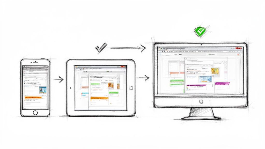
One of the biggest performance killers is serving the same giant image to everyone, whether they're on a massive desktop or a small phone. The fix? Responsive images. This technique lets the browser choose and download the most appropriately sized version for its current screen.
The native HTML way to do this is with the srcset and sizes attributes.
- The
srcsetattribute gives the browser a list of available image files and their widths. - The
sizesattribute tells the browser how much screen space the image will fill at different viewport sizes.
Here’s what that looks like in practice:
<img
  srcset="https://media.pixel-fiddler.com/my-source/media/my-image-480w.jpg 480w,
          https://media.pixel-fiddler.com/my-source/media/my-image-800w.jpg 800w,
          https://media.pixel-fiddler.com/my-source/media/my-image-1200w.jpg 1200w"
  sizes="(max-width: 600px) 480px,
         (max-width: 900px) 800px,
         1200px"
  src="https://media.pixel-fiddler.com/my-source/media/my-image-800w.jpg"
  alt="A descriptive alt text for the image"
/>
With this code, a small-screen device will only download the tiny 480w version, while a big desktop monitor gets the crisp 1200w version. Everyone wins with faster load times and less wasted bandwidth.
Finding the Balance with Smart Compression
Compression is absolutely necessary for shrinking file sizes, but going too far is what creates those ugly, blocky artefacts. The real goal is to find that sweet spot—where you’ve removed as much data as possible without any noticeable drop in visual quality.
Smart compression isn't just about making a file smaller; it's about making it smaller without compromising the user's visual experience. The key is to reduce the file size just enough that the human eye can't perceive a difference, preserving quality while boosting performance.
This is where automated tools really shine. Instead of just guessing at a quality setting, you can use a service that analyses each image and applies the perfect level of compression. Our free image compression tools can handle this for you, making sure your images are both lean and sharp.
Supercharge Page Speed with Lazy Loading
Finally, remember that not every image needs to load the second a visitor hits your page. Any images "below the fold"—the ones you have to scroll down to see—can wait. This technique is called lazy loading.
It’s incredibly simple to implement. Just add the loading="lazy" attribute to your <img> tags, and you’re telling the browser to hold off on downloading that image until the user scrolls close to it.
<img src="https://media.pixel-fiddler.com/my-source/media/my-image.jpg"
     loading="lazy"
     width="800"
     height="600"
     alt="A descriptive alt text"
/>
This one tiny change can make a huge difference to your initial page load speed and your LCP score. The browser gets to focus its energy on rendering the critical, visible content first, creating a much faster and smoother experience for your visitors.
Let PixelFiddler Automate Your Image Optimisation
Manually tweaking every single image on your website is a noble effort, but let's be honest—it's a massive time sink and simply doesn't scale. A far better way is to automate the whole process, applying all the best practices on the fly without ever having to open an image editor. This is where PixelFiddler’s URL-based approach turns a tedious chore into a simple, real-time solution.
You can fix the classic problems that cause low-quality images—like bloated files and wrong formats—just by adding a few instructions to an image's URL. Imagine you have a huge, unoptimised JPEG file sitting in your cloud storage.
Here’s what that original, unoptimised image might look like, served straight from the source.
This image is way bigger than it needs to be for most screens, slowing down your page and frustrating visitors. Let’s fix it.
From Manual Drudgery to Automated Perfection
The beauty of PixelFiddler is that you leave your original, high-resolution master file completely untouched. All the magic happens by modifying the src attribute in your <img> tag. This on-the-fly approach means every visitor gets a perfectly sized and formatted image, every time, with zero manual work from you.
Let's look at a standard <img> tag pointing to our oversized original:
<!-- Before: The original, unoptimised image -->
<img src="https://media.pixel-fiddler.com/my-source/media/my-image.jpg" alt="A beautiful mountain landscape">
With this code, every user is forced to download the full-size image, which could easily be several megabytes. The first easy win is to resize it. For a blog post, a width of 800 pixels is plenty.
<!-- After: Resizing the image with a URL parameter -->
<img src="https://media.pixel-fiddler.com/my-source/media/my-image.jpg?w=800" alt="A beautiful mountain landscape">
Just by adding ?w=800, we've told PixelFiddler to resize the image instantly, slashing its file size. This one change makes a huge difference to load times, but we can do so much more to stamp out the causes of low-quality images.
Unlocking Next-Gen Formats and Smart Compression
Resizing is a great start, but the real performance boost comes from using modern image formats and intelligent compression. PixelFiddler makes this dead simple.
First, let's add format=auto to the URL. This one command is incredibly powerful. It tells PixelFiddler to check what the user's browser can handle. If it supports a modern format like WebP or AVIF, the image gets converted on the spot. If not, it gracefully falls back to the original JPEG. Everyone wins.
Next, we'll add quality=auto. Instead of picking a single compression level and hoping for the best, this parameter uses clever algorithms to find the perfect trade-off between file size and visual fidelity. It shrinks the file as much as possible without introducing any ugly artefacts, keeping the details sharp.
The
quality=autofeature is all about finding that perceptual sweet spot. The aim is a massive file size reduction—often over 75%—while making sure the compressed image looks identical to the original to the human eye.
Here’s how our <img> tag looks with these new, powerful additions:
<!-- After: Adding auto format conversion and quality tuning -->
<img src="https://media.pixel-fiddler.com/my-source/media/my-image.jpg?w=800&format=auto&quality=auto" alt="A beautiful mountain landscape">
With just three simple parameters, our image is now resized, converted to the best format for each user, and compressed with precision.
Nail Responsiveness Without the Complex Code
The final piece of the puzzle is making our image truly responsive. You could spend hours writing complex srcset and sizes attributes by hand, but PixelFiddler offers a much simpler path by automatically handling the device pixel ratio (DPR).
By serving up images that are aware of the screen's pixel density, you guarantee that users on high-resolution displays (like Retina screens) see a stunningly sharp image. Meanwhile, users on standard displays get a smaller, faster-loading file. This simple step avoids that blurry, pixelated look that is a sure sign of low-quality images on modern phones and laptops. You can play around with these transformations and see the results for yourself in our interactive PixelFiddler demo.
The final URL brings all our optimisations together in one neat package:
<!-- Final: A fully optimised and responsive image -->
<img src="https://media.pixel-fiddler.com/my-source/media/my-image.jpg?w=800&format=auto&quality=auto" alt="A beautiful mountain landscape">
What started as a clunky, one-size-fits-all image is now a dynamic, highly-optimised asset. It adapts to every user's device, delivering the absolute best quality at the smallest possible file size—all without you ever touching the original file or wrestling with complicated frontend code. This is how you solve image performance for good.
A Few Common Questions About Image Quality
Diving into image optimisation can feel like a maze of technical terms. It's easy to get tangled up in questions about compression, resolution, and formats. Let's clear the air and tackle some of the most common queries I hear from people trying to get their website visuals just right.
Does Compressing an Image Automatically Make It Low Quality?
Not at all. This is a big misconception. The real goal is intelligent compression, not just blindly shrinking a file. Modern algorithms, especially in next-gen formats like WebP and AVIF, are incredibly good at cutting down file size without you ever noticing a dip in quality.
Think of it this way: smart tools analyse an image and figure out where they can remove data without impacting what we actually see. They protect the important details while ditching the digital baggage.
In my experience, you can often slash file sizes by 70-80% before the human eye can even spot a difference. The result is a lightning-fast website with images that still look crisp and professional. If you want to see this in action, our free image compression tool lets you find that perfect sweet spot yourself.
What's the Real Difference Between Image Resolution and Dimensions?
This one trips a lot of people up, but it's simpler than it sounds. For anything on the web, what truly matters are the pixel dimensions—for example, an image that is 1200 pixels wide by 800 pixels tall. This number dictates the actual size of the image on a screen.
Resolution, on the other hand (measured in PPI or DPI), is really a concern for printing. It has almost no bearing on how an image looks in a browser.
A classic mistake that leads to low-quality images is taking a small image (say, 400px wide) and stretching it with code to fill a much larger space (like an 800px container). The browser has to invent new pixels to fill the gap, which is why things end up looking blurry and pixelated. The simple rule is to always serve an image with pixel dimensions large enough for the space it needs to fill.
Can I Fix My Website's Images Without Re-uploading Everything?
Absolutely, and thank goodness for that! Imagine having to manually re-upload thousands of images. Modern image CDNs like PixelFiddler are built to slot right into your existing workflow, so there's no need for a massive, disruptive migration.
The process is surprisingly straightforward. You just connect your current storage—whether it's an S3 bucket or a folder on your server—as a source. Then, you simply update the image URLs on your site to point to the PixelFiddler domain.
All the magic—resizing, reformatting, and compressing—happens on the fly. You can upgrade your entire image library and fix quality issues across your site without the headache of re-uploading a single file.
This approach is a huge time-saver and delivers an instant boost to performance. If you're looking to go deeper, our guide on improving web core vitals is a great place to start.
Which Image Format Is Best for Web Performance?
For most photos and complex visuals, AVIF and WebP are the clear winners. They offer far better compression than old-school formats like JPG, giving you much smaller files at the same visual quality. Smaller files mean faster pages. It's as simple as that.
Here’s a quick rule of thumb:
- AVIF & WebP: Your go-to for photographs. They offer the best bang for your buck in terms of quality versus file size. You can easily convert to WEBP using our free tool to see the difference.
- SVG: The only choice for logos, icons, and simple illustrations. As a vector format, it scales perfectly to any size while keeping a minuscule file footprint.
- PNG: Reserve this for when you absolutely need a transparent background and WebP isn't an option for some reason.
The best strategy today is to use a service that automatically serves AVIF or WebP to browsers that can handle them, while gracefully falling back to JPG for older ones. This ensures every visitor gets the fastest, best-looking experience possible.
Ready to put low-quality images in the rearview mirror and give your site the performance it deserves? With PixelFiddler, you can automate your entire image workflow in minutes. Just connect your storage, update your URLs, and let our API deliver perfectly sized, crisp, and fast-loading images to every user. Start optimising for free with PixelFiddler today.