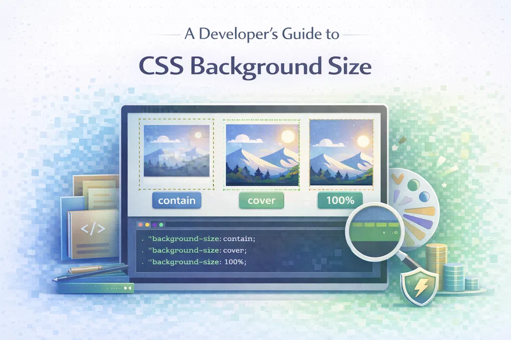
A Developer's Guide to CSS Background Size
The CSS background-size property is one of those incredibly powerful tools that gives you total control over how your background images behave. It’s what lets you tell an image to stretch, shrink, or sit perfectly within its container, making sure your design looks polished and professional on any screen. If you want to build truly responsive and beautiful websites, getting a grip on this property is non-negotiable.
The CSS background-size property is one of those incredibly powerful tools that gives you total control over how your background images behave. It’s what lets you tell an image to stretch, shrink, or sit perfectly within its container, making sure your design looks polished and professional on any screen. If you want to build truly responsive and beautiful websites, getting a grip on this property is non-negotiable.
Why CSS Background Size Is a Developer's Best Friend
We've all been there. You get a background image looking absolutely perfect on your big desktop monitor, only to find it's a stretched, pixelated, or awkwardly cropped mess on a phone. It's a classic web development headache, and background-size is the cure.
Without it, you’re basically letting the browser guess how to display your image, and browsers aren't designers. A poorly scaled background doesn't just look sloppy; it can seriously hurt the user's experience and even slow your site down.
The Impact of Poorly Sized Backgrounds
When a background image isn’t sized correctly, it introduces a host of problems that undermine both your design and your site's performance.
- Distortion and Pixelation: Asking a small image to stretch across a huge container will make it look blurry and unprofessional, instantly cheapening your site's feel.
- Poor User Experience: Important details in the image might get cut off, or it could be squished into an unrecognisable shape, leaving visitors confused.
- Slow Page Load Times: On the flip side, using a massive image for a small space forces people to download kilobytes (or megabytes!) of data they don't need. According to research from HTTP Archive, images are often the biggest culprit for heavy pages, which directly impacts loading speeds and Core Web Vitals.
By using background-size, you set clear, predictable rules for how an image should act. You can learn more about creating the perfect visual experience in our complete guide to background images.
A Quick Reference for Common Values
Before diving deep, it’s useful to get familiar with the main values background-size accepts. Think of them as different instructions you can give the browser, each suited for a specific design goal.
Key Takeaway: The
background-sizeproperty isn't just cosmetic. It's a fundamental part of responsive design, ensuring images look great and load efficiently.
To help you get started, this table summarises the most common values and when you might want to reach for them.
Quick Reference for CSS Background Size Values
| Value | Description | Ideal Use Case |
|---|---|---|
auto | The default. The browser uses the image’s original, intrinsic dimensions. No scaling happens. | When you need an image to appear at its natural size without any changes. |
cover | Scales the image as large as needed to completely fill the container, even if it means cropping off the sides or top/bottom. | Perfect for full-screen hero sections where you can't have any empty gaps. |
contain | Scales the image as large as possible but ensures the entire image is visible. This might leave some empty space. | Ideal for logos, icons, or any image where showing the whole thing without cropping is critical. |
<length> | Lets you set an exact size with units like pixels (px), em, or rem (e.g., 200px 100px for width and height). | When you need absolute, pixel-perfect control for a specific layout. |
<percentage> | Sizes the image based on a percentage of its container's dimensions (e.g., 50% 100%). | Great for creating responsive patterns that scale fluidly with their parent element. |
Each of these values provides a different tool for your design toolkit, giving you the flexibility to handle just about any situation.
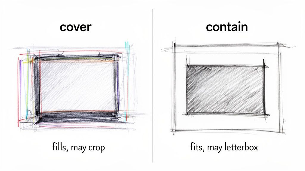
Comparing Cover And Contain For Perfect Scaling
When you specify exact pixel or percentage values, you get pinpoint accuracy—but two simple keywords often save the day: cover and contain. Both handle responsive resizing automatically, yet they aim for opposite goals. Mastering their differences is essential for reliable background handling.
Imagine you’re hanging a photo in a frame. Using cover is like stretching the photo until it fills every edge of the frame—even if you trim a bit off. With contain, you make sure the entire picture is visible, which might leave slivers of empty space around it.
Now, let’s unpack exactly how each behaves and when to pick one over the other.
Using Cover For Full-Bleed Backgrounds
When you want an image to dominate the viewport without any gaps, background-size: cover is your friend. It scales the image up (or down) so it completely spans its container while preserving its aspect ratio.
This means:
- No empty space ever shows through.
- Some edges of the image may get clipped to maintain the original proportion.
Consider a typical hero section:
.hero-section {
  width: 100%;
  height: 80vh; /* 80% of the viewport height */
  background-image: url('https://media.pixel-fiddler.com/my-source/media/my-image.jpg');
  background-size: cover;
  background-position: center center;
  background-repeat: no-repeat;
}
On a wide desktop, the top and bottom might be cropped. On a tall mobile, you’ll likely lose bits on the sides.
Crucial Tip: Always pair background-size: cover with background-position: center center. That way, the focal point stays front and centre even as the browser chops off edges.
Using Contain To Preserve The Entire Image
If you cannot afford to cut off any part of your image—think logos, icons or product shots—background-size: contain is the go-to. It rescales the image just enough to fit within the container, letterboxing as needed.
You’ll notice:
- The whole image remains in view, every time.
- Empty space appears on the top/bottom or sides when the aspect ratios differ.
Ideal scenarios include:
- Logos: Never crop a trademark.
- Icons: Keep every curve intact.
- Product Photos: Show all angles without surprise truncation.
Here’s how you might set up a 100px by 100px feature icon:
.feature-icon {
  width: 100px;
  height: 100px;
  background-image: url('https://media.pixel-fiddler.com/my-source/media/icon.svg');
  background-size: contain;
  background-position: center center;
  background-repeat: no-repeat;
}
The icon will always fit nicely inside its box, undistorted and uncropped.
For best performance, don’t forget to compress large images before deployment. A tool like Pixel Fiddler’s image compressor slims down files without visible quality loss. Faster assets mean better Core Web Vitals—dive deeper in our guide to mastering First Contentful Paint.
Taking Control With Precise Sizing Values
While cover and contain are fantastic, they're essentially on autopilot. They do a great job of scaling an image to fit its container, but sometimes you need to grab the steering wheel yourself. For pixel-perfect layouts, delicate patterned backgrounds, or any design where exact dimensions matter, you'll want to define the background-size with precise values.
This is where you move beyond the automatic options and tell the browser exactly how wide and tall your background image should be, using units like pixels (px), relative units (rem), or percentages (%).
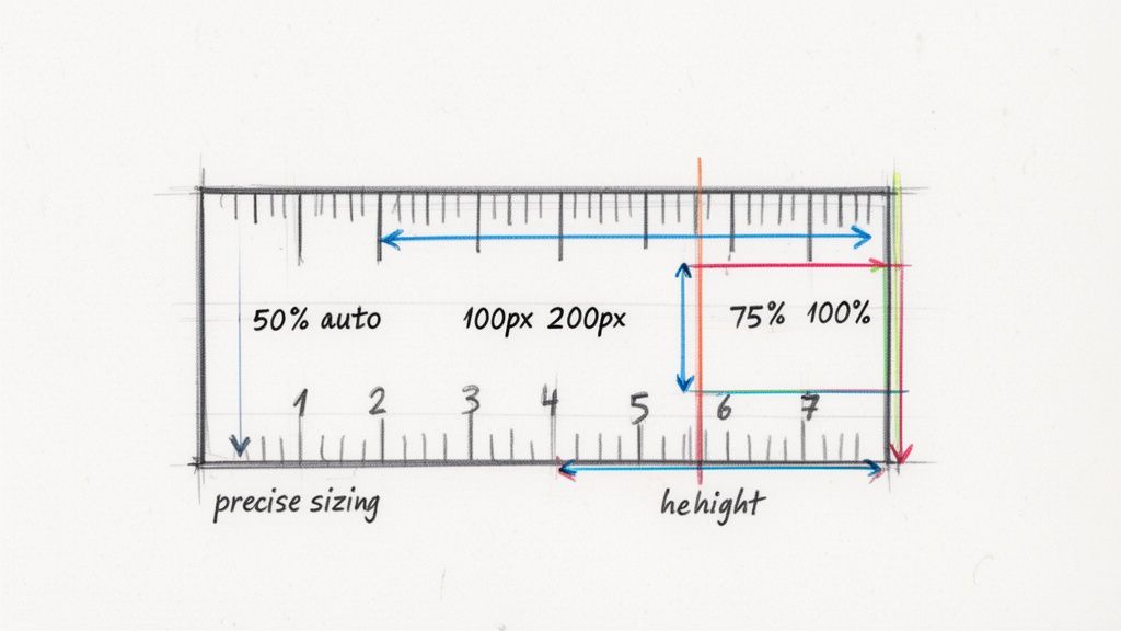
Defining Dimensions with Lengths and Percentages
The background-size property accepts either one or two values. If you give it just one, that value sets the width, and the browser cleverly adjusts the height to maintain the image's original aspect ratio. Provide two values, and you're setting the width and height, respectively.
- Length Units (
px,rem****,em****): Using fixed units like pixels is perfect for things that shouldn't change size, even if the container does. Think of a small, repeating texture or a decorative icon that needs to stay consistent. - Percentage Units (
%): Percentages are your go-to for responsive behaviour. They size the background image relative to its container. Abackground-sizeof50%makes the image's width half of its parent element's width, allowing it to scale up and down smoothly.
For instance, to set a background image to be a fixed 300 pixels wide and 150 pixels tall, your CSS would look like this:
.element {
  background-image: url('https://media.pixel-fiddler.com/my-source/media/my-image.jpg');
  background-size: 300px 150px;
  background-repeat: no-repeat;
}
This gives you total control, but there's a catch. If your new dimensions don't match the image's original aspect ratio, it's going to look stretched and distorted. That's where the auto keyword becomes your best friend.
Preserving Aspect Ratio with the Auto Keyword
The auto keyword is the secret to preventing a distorted background. When you use auto for either the width or height, you're telling the browser, "You figure this part out." It calculates the missing dimension automatically to keep the image's proportions intact.
By pairing a specific value with
auto, you get the best of both worlds: precise control over one dimension and a perfectly preserved aspect ratio.
This is an incredibly useful trick for responsive design. Let's say you want a logo to always take up half the container's width, but you don't want it to look squished. Easy.
.responsive-logo {
  background-image: url('https://media.pixel-fiddler.com/my-source/media/logo.png');
  /* Set width to 50% of container; height scales proportionally */
  background-size: 50% auto;
  background-repeat: no-repeat;
  background-position: center;
}
You can just as easily flip it around, fixing the height and letting the width adjust:
.fixed-height-banner {
  height: 80px;
  background-image: url('https://media.pixel-fiddler.com/my-source/media/banner.jpg');
  /* Set height to 80px; width scales proportionally */
  background-size: auto 80px;
  background-repeat: no-repeat;
}
A Quick Word on Performance
While setting a precise size gives you design control, it's important to remember it doesn't magically shrink the image file. If you have a massive 4000px wide photograph and you set its background-size: 200px auto, the user's browser still has to download that entire enormous file. This is a huge waste of bandwidth that will slow your page down and harm your site's Core Web Vitals.
The golden rule is to always serve an image that's already sized appropriately for its final display. For an extra performance boost, convert your images to modern formats. Switching from an old-school PNG to a next-gen format like WebP, for example, can dramatically reduce file size. You can dive deeper into this in our guide to PNG to WebP conversion. Doing this by hand is a chore, but a good image compression tool can automate the entire process, ensuring your backgrounds are not only pixel-perfect but also lightning-fast.
Building Responsive Backgrounds With Media Queries
We've covered how background-size lets an image flex to fit its container. But what happens when the image itself is the real problem? That stunning, high-resolution hero image looking sharp on a 27-inch desktop monitor can absolutely cripple performance on a mobile phone. You're forcing users on cellular data to download a huge file just for a tiny screen.
This is where you get to combine the flexibility of background-size with the power of CSS media queries. Think of a media query as a conditional rule in your CSS; it only kicks in when specific criteria are met, like the screen reaching a certain width. This simple tool allows us to serve completely different images to different devices—a non-negotiable strategy for any fast, modern website.
Why Swapping Images Is a Performance Game Changer
Serving one massive, one-size-fits-all image is a surprisingly common mistake, and it comes with a hefty performance penalty. Large, unoptimised images are one of the biggest culprits behind slow websites, which directly frustrates users and hurts your site's SEO ranking.
By loading a smaller, optimised image specifically for mobile users, the benefits are immediate:
- You dramatically cut down page load times, which is crucial for keeping impatient visitors from bouncing.
- You improve Core Web Vitals, particularly the Largest Contentful Paint (LCP) score that Google cares so much about.
- You save your users' mobile data, creating a much better, more considerate experience for everyone.
- You lower your server bandwidth costs, which can save you real money over time.
This isn't just about making a site feel faster; it has a direct impact on business goals. A 2018 study by Google found that as page load time goes from 1 to 3 seconds, the probability of a user bouncing increases by 32%. That’s a massive hit.
Writing Your First Media Query
The concept is beautifully simple: you start by styling for the smallest screens first and then use media queries to add or change styles as the screen gets larger. This "mobile-first" approach is a web development best practice for a reason. It guarantees that devices with the most limitations (like slower connections and less processing power) get the lightest, fastest version of your site by default.
Let's walk through a real-world example. We'll set up a lightweight, portrait-oriented background for mobile devices and then swap it for a larger, landscape version on desktops.
First, we lay down the default styles for mobile:
.hero-banner {
  background-image: url('https://media.pixel-fiddler.com/my-source/media/mountain-portrait-small.jpg');
  background-size: cover;
  background-position: center;
  background-repeat: no-repeat;
  height: 100vh;
}
With this code, every device starts by getting the small mountain-portrait-small.jpg image. Now, we'll add a media query to introduce a new rule that only applies to larger screens.
A media query acts like a conditional gate. The CSS inside it will only be applied if the user's browser window meets the specified criteria, such as being wider than 768 pixels.
/* This rule applies ONLY when the screen is 768px wide or wider */
@media (min-width: 768px) {
  .hero-banner {
    background-image: url('https://media.pixel-fiddler.com/my-source/media/mountain-landscape-large.jpg');
  }
}
It’s that straightforward. A mobile user only ever downloads the small image. But when someone on a tablet or desktop with a viewport wider than 768px visits the page, their browser reads the media query and fetches the larger, more appropriate mountain-landscape-large.jpg instead. The background-size: cover we defined earlier stays in effect, ensuring this new, bigger image also scales perfectly to fill the container.
This technique is fundamental, and you can take it even further. For a deeper dive into framework-specific strategies, check out our guide to Next.js image optimisation.
This approach hands you fine-grained control over the user experience. You're not just delivering a design that looks good; you're engineering one that is technically superior and performs beautifully, which is the cornerstone of modern web development.
Boosting Performance for Faster Loading Backgrounds
A stunning background image can make a design, but it should never come at the expense of your website's performance. When a large background image is the first thing users see, it directly impacts your site's Largest Contentful Paint (LCP), a key Core Web Vital. Slow-loading images mean poor LCP scores, which frustrates visitors and can even hurt your search engine rankings.
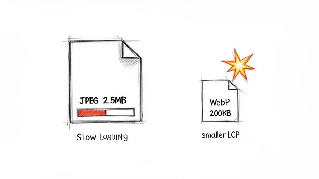
The problem almost always boils down to file size. Every kilobyte counts, especially for users on mobile devices or slower networks. Research from HTTP Archive consistently shows that images are the heaviest part of most web pages. Sending a massive, multi-megabyte photo to a small phone screen is just plain inefficient and creates a sluggish, frustrating experience.
The Power of Modern Image Formats
Luckily, the solution isn't to ditch beautiful images—it's to serve them more intelligently. This journey starts with picking the right file format. While we all know JPEG and PNG, modern formats like WebP and AVIF are game-changers, offering far better compression.
- WebP: Developed by Google, WebP images are often 25-34% smaller than a similar-quality JPEG. That’s a significant saving with no noticeable difference to the human eye.
- AVIF: This newer format is even more impressive. It can often produce files that are 50% smaller than JPEGs while maintaining the same visual quality.
By converting your background images to these next-gen formats, you can slash their file sizes. This means faster downloads, a better LCP score, and a website that feels instantly more responsive. You can learn more about making the switch by exploring how to convert PNG files to the AVIF format.
Automating Optimisation for Peak Performance
Let's be realistic: manually resizing, compressing, and converting every single image for different devices is a tedious and error-prone chore. A much smarter approach is to automate the entire workflow. This is where an image optimisation API, like PixelFiddler, comes into its own.
Instead of fighting with image editing software, you can handle everything on the fly. An image API can automatically:
- Serve Modern Formats: It checks what the user's browser supports and sends the most efficient format (like AVIF or WebP), gracefully falling back to JPEG for older browsers.
- Resize Dynamically: It resizes images based on simple URL parameters, ensuring you serve a perfectly sized image for every container and screen.
- Apply Smart Compression: It shrinks the file size using advanced compression algorithms without degrading the visual quality.
For example, a simple URL can be transformed to deliver a highly optimised image in seconds.
Original URL:
https://media.pixel-fiddler.com/my-source/media/hero-image.jpg
Optimised URL with PixelFiddler:
https://cdn.pixel-fiddler.com/my-source/w_1200,f_auto,q_auto/media/hero-image.jpg
This new URL tells the service to resize the image to a 1200-pixel width (w_1200), automatically pick the best format (f_auto), and apply the optimal quality setting (q_auto). This hands-off approach ensures every user gets the fastest possible version of your background image, every time.
Adopting an automated image optimisation strategy is one of the highest-impact changes you can make to improve your site's Core Web Vitals. It directly addresses the performance bottlenecks caused by large media files.
When you combine the fine-tuned control of background-size with a powerful image optimisation pipeline, you can create visually rich experiences that are also incredibly fast. This dual focus on aesthetics and performance is what separates good websites from great ones, ensuring your site not only looks amazing but also delivers a truly exceptional user experience.
Tackling Common Background Sizing Headaches
Even the most experienced developers can get snagged by the peculiarities of CSS background images. What seems like a simple property can quickly unravel into frustrating bugs that mess up your entire layout. Let's walk through some of the most common issues you'll encounter with background-size and how to fix them for good.
"Why Does My Background Image Look So Pixelated?"
This is probably the most frequent complaint. You’ve got a stunning, high-resolution image, but once it's on the website, it looks blurry and disappointingly low-quality.
What's Happening: The problem almost always boils down to one thing: using a small image and forcing it to fill a much larger space. When you use background-size: cover or a value like 100% 100% on an image that's smaller than its container, you're telling the browser to stretch it. That stretching process is what creates the fuzzy, pixelated effect.
The Fix: Start with an image that's at least as big as the largest area it will need to fill. For a full-screen hero section on a typical 1920px-wide monitor, your source image needs to be around that width. This way, the browser is always scaling the image down, which preserves its sharpness, rather than scaling it up.
"Why Is cover Cropping My Image in a Weird Way?"
You've set background-size: cover aiming for that slick, full-bleed look, but on mobile or tablet screens, the most important part of your image vanishes off the edge.
What's Happening: Remember, cover’s only job is to make sure the background fills the entire container without distorting the image's proportions. It makes no promises about which part of the image stays visible. As the container changes shape—say, from a wide desktop screen to a tall phone screen—cover will crop different parts of the image to maintain that perfect fit.
The Fix: This is a job for background-position. By default, the image is anchored to the centre, but you can easily change that to keep the subject in frame.
Let's say the focal point of your image is on the right-hand side. You can tell the browser to prioritise it:
.hero-section {
  background-image: url('https://media.pixel-fiddler.com/my-source/media/my-image.jpg');
  background-size: cover;
  background-position: center right; /* This keeps the right edge in view */
}
With this small addition, you're guiding the browser on how to crop, giving you a much more predictable and art-directed result across different devices.
"Why Isn't My Background Image Showing Up At All?"
The classic head-scratcher. Your CSS looks flawless, the image path is correct, but you're just staring at a blank space on the page.
What's Happening: Nine times out of ten, this happens because the element holding the background has no height. A background image can only exist within the boundaries of its container. If an element like a <div> has no content inside it and no explicit height or min-height, its actual height is zero. You can't see a background inside a box that's 0 pixels tall.
The Golden Rule: An element must have dimensions for its background to be seen. If a container's height is
0, its background is effectively invisible, no matter what you set forbackground-size.
The Fix: You just need to give the container some space to exist. Here are a few ways to do that:
- Set a fixed height:
height: 400px; - Use viewport units for a responsive touch:
min-height: 50vh;(which means 50% of the viewport's height) - Let content do the work: Adding text or other elements inside, along with some padding, will naturally give the container height.
By ensuring the container has a defined area, you're giving the background image the canvas it needs to finally appear.
Fixing bugs is half the battle; the other half is proactive optimisation. PixelFiddler helps you sidestep these performance problems from the get-go by automatically serving perfectly sized, compressed, and next-gen formatted images to every user. Its powerful API can slash your image bandwidth and give your site's Core Web Vitals a massive boost. Start optimising for free with PixelFiddler.