Build an Instant Fast Image Resizer Pipeline
A fast image resizer is essentially a service that shrinks image dimensions and file sizes on the fly, usually through a simple URL-based API. This real-time approach is a game-changer for web performance. It means you can serve up perfectly sized images to every user instantly, slashing page load times and boosting user experience without having to manually edit a single file.
A fast image resizer is essentially a service that shrinks image dimensions and file sizes on the fly, usually through a simple URL-based API. This real-time approach is a game-changer for web performance. It means you can serve up perfectly sized images to every user instantly, slashing page load times and boosting user experience without having to manually edit a single file.
Why Slow Images Are Killing Your Website
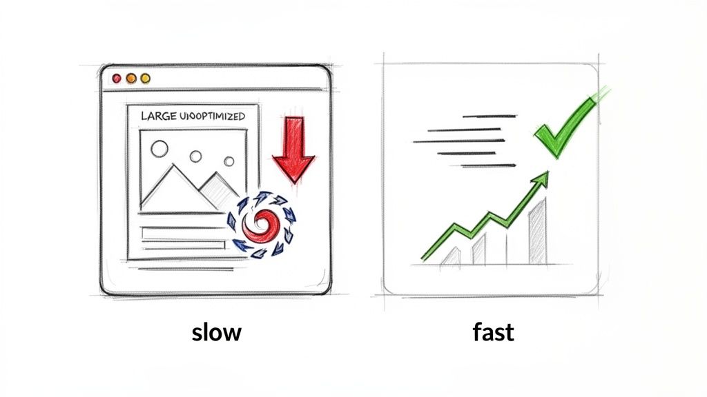
Let's be blunt: slow-loading images are more than just a minor hiccup for your visitors. They are silent assassins for your conversion rates and SEO rankings. The link between bloated, oversized images and lost revenue is direct, measurable, and often painful. For any online business, but especially in e-commerce, visuals are the star of the show—but they frequently carry a hefty performance penalty.
When your images aren't sized correctly for the screen they're viewed on, they inflate your page's total weight and drag down load times. This has a direct, negative effect on Google's Core Web Vitals, especially the Largest Contentful Paint (LCP) metric. LCP is all about how quickly the most significant piece of content on a page becomes visible. According to Google's research, pages hitting an LCP of 2.5 seconds or less provide a much better user experience and are more likely to keep visitors engaged. If your homepage hero banner is a massive, unoptimised file, your LCP score will tank, and so will your search ranking.
The Real-World Impact of Page Speed
Imagine a typical e-commerce store scratching its head over high bounce rates on product detail pages. More often than not, the culprit is the beautiful, high-resolution product shots uploaded straight from a supplier, each weighing several megabytes. A potential customer browsing on their phone might have to wait five, ten, or even fifteen seconds for these images to appear. They're not going to wait. They'll leave long before the page even finishes rendering.
This isn't just a hypothetical scenario; it happens all the time. Research from Google and Deloitte has shown that even a 0.1-second improvement in page load speed can increase conversion rates. Conversely, a study by Portent found that a page load time jumping from one to three seconds can increase the bounce rate by 32%. Push that to five seconds, and the likelihood of a bounce skyrockets by 90% (Source: Portent, 2022).
This is where a fast image resizer completely changes the game. Instead of pushing a 5 MB original file to a user's phone, the system dynamically creates and delivers a perfectly cropped 50 KB version tailored to their exact screen. By improving your page speed and Core Web Vitals, you're not just making a small technical fix; you're implementing a core business strategy.
Tapping into Modern Formats and Automation
A fast image resizer also takes care of serving next-gen image formats like AVIF and WebP automatically. These formats provide far better compression than old-school JPEGs and PNGs, meaning even smaller file sizes with no noticeable drop in quality. You can see the difference for yourself with our free PNG to AVIF converter.
By intelligently serving these modern formats to browsers that support them (while providing traditional fallbacks for those that don't), you guarantee every single user gets the fastest experience possible. This kind of automation is what improves engagement, gives your SEO a serious boost, and ultimately helps your business grow.
Connecting Your Storage for Instant Image Transformations
Let's be honest, the old way of handling image resizing is a nightmare. Manually creating a dozen different sizes for every single upload is a huge time-sink and a relic of a bygone era. A modern, fast image resizing pipeline starts by plugging directly into where your images already live. This simple change cuts out the entire tedious cycle of downloading, resizing, and re-uploading, saving you countless hours and making your whole workflow feel effortless.
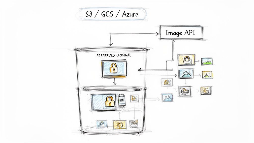
By linking your existing cloud storage—whether it's Amazon S3, Google Cloud Storage, or Azure Blob Storage—you create a single source of truth. Your original, high-resolution images stay right where they are, untouched and secure in your own bucket. This is a non-destructive process, which is a massive win. It gives you the freedom to play around with different sizes and formats without ever worrying about damaging your master files.
This setup doesn’t just speed up development; it completely sidesteps vendor lock-in. Because the originals are always under your control, you can swap out image processing providers whenever you want, without a painful migration process. Your assets stay yours, giving you a flexible and future-proof foundation for all your visual content.
The Power of On-Demand Generation
Once you’re connected, the image API essentially works as a dynamic proxy. When a user’s browser requests an image, the API grabs the original from your storage, applies your specified transformations in real-time, and serves up a perfectly optimised version. These new derivatives are then cached on a global CDN, so the next person to request that same image gets it instantly.
It’s an incredibly efficient way to work. You no longer have to guess every possible image dimension your site might need down the line. Need a tiny thumbnail for a mobile view? Or a massive hero image for a 4K display? The right size is created the moment it’s first requested. This guarantees you're not cluttering your storage with redundant files or, even worse, serving oversized assets that kill your page speed.
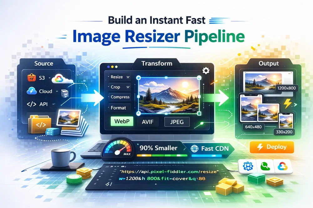
For developers, getting started is dead simple. You just construct a new URL that points to the image API and includes the path to your original image. For instance, a file sitting in your storage can be served through a URL that looks something like this: https://media.pixel-fiddler.com/my-source/media/my-image.jpg.
Key Takeaway: By connecting your cloud storage, you maintain a single, pristine original for every image. All the different versions are generated and cached on the fly, which cuts out manual work, slashes storage costs, and keeps your site fast and flexible.
This approach is also great for simplifying workflows where images come from all over the web. In fact, if you’re dealing with external image sources, you can find some useful tips in our guide on how to download an image from a URL.
Ultimately, integrating your storage with a fast image resizer API builds a powerful, automated pipeline. It takes the entire burden of image management off your team and hands it over to an intelligent system built for speed and scale. This frees you up to focus on what actually matters: building great user experiences.
Mastering Dynamic URLs for On-the-Fly Resizing
This is where the real power of a modern image resizer kicks in. You get precise, granular control over every single image on your website just by tweaking its URL. Forget installing complex software or firing up an editor for manual tweaks. Instead, you simply add easy-to-understand parameters to an image's web address to tell it exactly how to look and perform.
At its heart, the method is straightforward. You start with the base URL of your original, high-resolution image and append instructions. Let's say your main product shot lives at https://media.pixel-fiddler.com/my-source/media/my-image.jpg. That file might be several megabytes and thousands of pixels wide—great for archival, terrible for a fast-loading product grid.
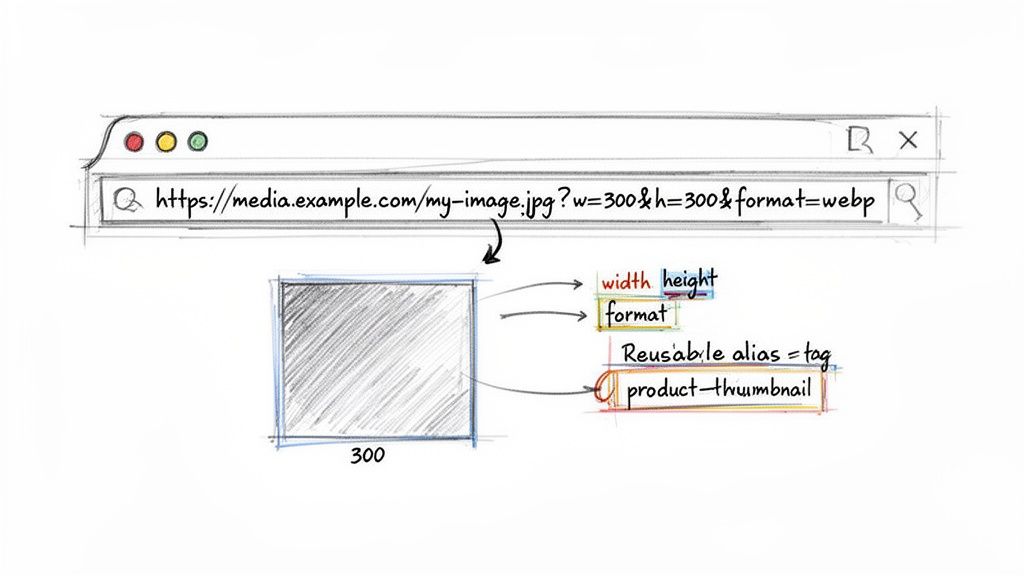
By tacking on a few query parameters, you can transform it instantly. For example, adding ?w=300&h=300 would immediately generate a 300x300 pixel square thumbnail. When a browser requests this URL, the image API grabs your original, performs the resize in milliseconds, and serves the perfectly sized new version.
Building More Advanced Transformations
Simple resizing is just the start. The real magic happens when you start layering multiple transformations to get the perfect result for any context. These dynamic URLs give you complete creative and technical control without ever touching the original file.
Here's a quick reference for some of the most common transformations you'll find yourself using.
Common URL-Based Image Transformations
A quick reference guide to essential URL parameters for resizing, cropping, and optimizing images on the fly.
| Transformation | Parameter Example | Description & Use Case |
|---|---|---|
| Resizing | w=800 or h=600 | Sets the width or height. Essential for creating responsive images that fit specific layouts, like hero banners or gallery thumbnails. |
| Cropping | crop=entropy | Trims the image to fit dimensions. Entropy or attention-based cropping intelligently focuses on the most interesting part of the image. |
| Format Conversion | format=webp | Converts the image to a modern format. Use webp or avif to drastically reduce file size while maintaining quality. |
| Quality Adjustment | q=80 | Sets the compression level from 1-100. A value around 75-85 is often the sweet spot between file size and visual fidelity. |
| Fit Mode | fit=cover | Controls how an image fits into the specified dimensions. cover crops to fill, while contain letterboxes the image without cropping. |
You can combine these parameters to get really sophisticated results. For instance, you could resize, crop to a specific focal point, and convert to AVIF with 75% quality, all from a single URL request. If you want to dive deeper into the benefits of format conversion, our guide on converting PNG to WebP has some great insights.
This on-the-fly approach is incredibly flexible. It lets you experiment and fine-tune your images without ever having to re-upload or modify the master file safely stored in your cloud bucket.
Simplify Your Workflow with Presets and Aliases
Let's be honest, manually adding long strings of parameters to every image URL can get messy and makes your code a pain to manage. This is exactly where aliases, or presets, become your best friend. An alias is just a saved collection of transformations that you can trigger with a single, easy-to-remember name.
So, instead of a long, ugly URL, you could create a preset called product-thumbnail. This preset might contain instructions to resize to 300x300, convert to WebP, and apply a specific quality setting. Your URL then becomes clean and self-explanatory: .../my-image.jpg?p=product-thumbnail.
This is a game-changer for site-wide consistency and maintenance. If you later decide all your product thumbnails should be 350x350, you just update the
product-thumbnailpreset in one place. Every image using that alias across your entire website will be updated automatically—no code changes required.
Let Modern Browser Hints Automate Your Responsive Images
Let's be honest, manually writing srcset and sizes attributes for every image is a nightmare. It’s a tedious, fragile process where you’re constantly trying to guess every possible device size, leading to bloated code that’s a pain to maintain. There’s a much better way: let the browser do the heavy lifting with Client Hints.
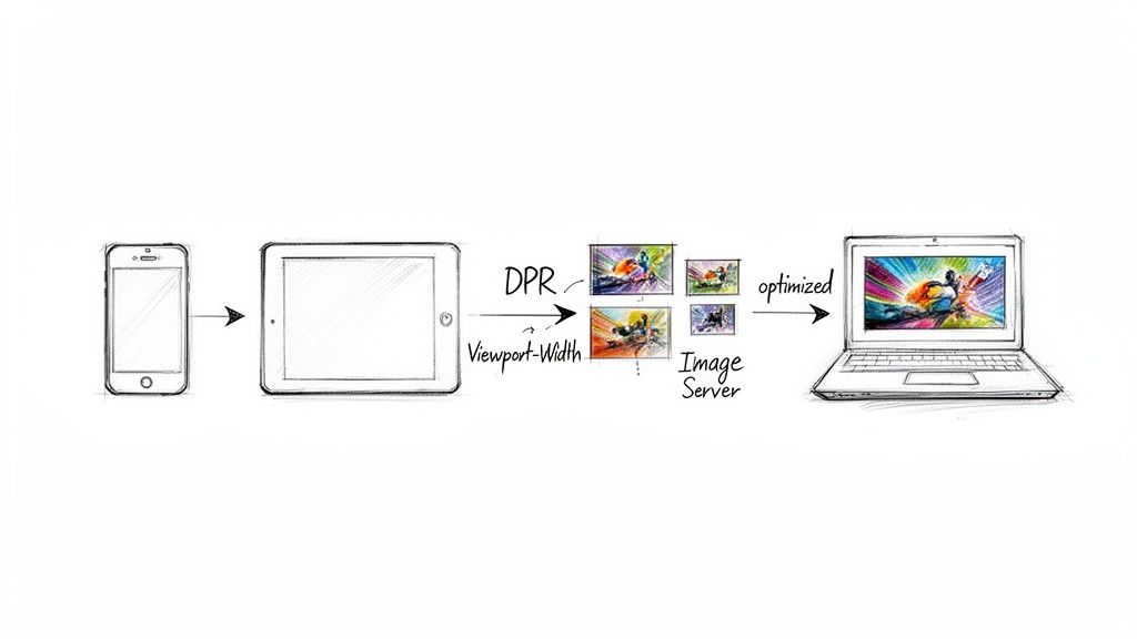
This modern web standard is the secret to a truly automated and high-performance image strategy. It allows a browser to send crucial details about the user's device straight to your image server with each request. Instead of guessing, your image API gets the exact data it needs to serve the perfect image every time.
The Browser as Your Guide
At its core, Client Hints are just a set of HTTP request headers that paint a clear picture of the user's viewing environment. A fast image resizer can read this information and make smart, on-the-fly decisions about which image variant to send back.
These are the game-changing hints you need to know about:
- DPR (Device Pixel Ratio): This tells you if the user is on a standard screen (1x) or a high-resolution "Retina" display (2x or 3x). Your API can immediately serve a higher-res image to keep things looking crisp.
- Viewport-Width: You get the precise width of the browser window. The server can then resize the image to fit the layout perfectly, cutting out wasted pixels and saving bandwidth.
- Width: This hint is even more specific, telling you the final rendered size of an image within the page layout, allowing for incredibly accurate resizing.
- Save-Data: A lifesaver for users on slow or metered connections. When this is enabled, the API can automatically deliver a much lower-quality, heavily compressed image to get content in front of them faster.
By leaning into this browser-to-server conversation, you can deliver a perfectly optimised image to every single user—all without writing a single line of
srcset. Your front-end code gets cleaner, and your images are always tailored to the real-world context.
The Real-World Impact on Performance and Conversions
This isn't just about simplifying your code; it's about making a real difference to your site's performance and your business goals. When you deliver smaller, context-aware images, you directly improve your Largest Contentful Paint (LCP) score—a metric that’s vital for both user experience and SEO.
The commercial benefits are just as compelling. According to a Deloitte report, a mere 0.1-second improvement in site speed can lead to an 8% increase in conversions for retail sites. (Source: Deloitte, "Milliseconds Make Millions," 2020). Optimizing images with a fast resizer is one of the most direct ways to achieve these speed gains.
Modern frameworks like Next.js even have built-in components that make this almost effortless. To see how this all comes together in practice, check out our deep dive into implementing advanced Next.js image optimisation. When you combine a smart framework with an intelligent image API, you end up with a hands-off, high-performance workflow that just works.
Speeding Things Up With a Global CDN and Caching
Getting your images perfectly optimised is a huge win, but it's only half the story. If that feather-light image takes forever to travel from your server to the user's screen, all that hard work is for nothing. This is where the final, crucial piece of the puzzle slots into place: blazing-fast delivery, powered by a Content Delivery Network (CDN) and smart caching.
Think of a CDN as a global network of servers, strategically placed around the world. The first time someone requests one of your dynamically transformed images, it gets generated and then stored—or cached—on the CDN server closest to them. From that point on, any other user in that region gets the image directly from that nearby "edge location." The result? A massive drop in latency.
This whole process not only makes your site feel snappier but also takes a huge load off your origin server. Instead of your main server sweating to fulfil every single image request, the CDN handles the bulk of the traffic. This keeps your site responsive and stable, even when you get a sudden surge in visitors.
Dialling in Your Cache Settings
To really squeeze every last drop of performance out of your CDN, you need to give clear instructions to both the CDN and the user's browser on how long they should hold onto your images. We do this with cache-control headers. A well-tuned header tells the user's browser to keep a local copy, avoiding pointless re-downloads on subsequent visits.
For dynamically generated images, you can be pretty aggressive with caching. A great setup often includes:
public: This allows any cache, from the CDN to the browser, to store the image.max-age=31536000: This tells the browser to hang onto the image for a full year (that's 31,536,000 seconds!).immutable: This is a powerful hint that the file at this exact URL will never, ever change, stopping the browser from even bothering to check for a new version.
By setting long cache times, you create an almost instant experience for returning visitors, since their browser just pulls the images straight from its local storage. It’s a straightforward but incredibly effective way to boost your Core Web Vitals and make users happy.
For instance, a URL like
.../my-image.jpg?w=800is seen as a completely unique, cacheable file. If you tweak the transformation tow=801, the CDN treats it as a brand-new request. It will generate a new version and cache it separately, leaving the originalw=800version untouched.
Dealing With Updates and Cache Invalidation
Okay, so what if you need to update an image? If you replace the original my-image.jpg in your storage, the CDN is still happily serving the old, cached version. You need a way to tell it to get the new one. This is called cache invalidation, or sometimes "purging."
A proper image API like PixelFiddler will have tools for this. You can selectively purge individual image URLs or even flush entire folders from the CDN's cache. When you purge an image, you're essentially sending out an order to every server in the CDN to delete its copy. The very next time a user requests that image, the CDN will have to go back to your origin storage, grab the updated file, and create a fresh set of optimised versions to serve and re-cache. This gives you total control, making sure your content stays fresh without compromising on speed.
Got Questions? We've Got Answers
You're probably wondering about some of the practical details of putting a real-time image resizing pipeline into place. Let's tackle some of the most common questions that come up when people are getting started.
A big one is what happens to your original files. The whole process is non-destructive. Your high-resolution source images, safe in your S3 or GCS bucket, are never touched. The API just grabs a copy to create the optimised versions it needs on the fly.
Those new, transformed images get cached and zipped across the CDN to your users, while your master files stay pristine. This gives you total freedom to experiment with sizes, crops, and formats without ever worrying about messing up the originals.
How Does This Compare to Build-Time Plugins?
You've probably seen plugins that process images when you build or deploy your site. The problem? They have to crunch through your entire library every single time. For a site with thousands of images, this can turn a simple code push into a long, frustrating wait.
A real-time fast image resizer sidesteps that whole problem. It creates a new image version the first time it's requested, then caches it on the CDN for everyone else. Your builds stay lightning-fast, and you get way more flexibility. Need a new image size across the entire site? You can roll it out instantly without rebuilding a thing.
This on-demand approach is a game-changer for metrics like First Contentful Paint (FCP). When you deliver perfectly sized images without slowing down your server builds, you’re directly improving your Core Web Vitals and giving users a much slicker experience. We dive deeper into this in our guide to mastering FCP.
Can I Change Image Formats on the Fly?
You absolutely can. That's one of the best parts of a URL-based API. You can take a single source.png and tell the service to serve it as a cutting-edge AVIF or WebP file just by adding a parameter like format=avif to the URL.
Even better, this is usually paired with automatic content negotiation. The system can check what a user's browser supports and send the best format automatically—AVIF for Chrome, WebP for Firefox, and a standard JPG for an older browser. You get the best performance for every visitor, all from one source file. If you want to see it in action, check out our tools for converting PNG to AVIF or JPG to WebP.
What If I Update an Original Image?
Good question. When you upload a new version of an image to your cloud storage, the CDN will eventually pick up the change based on its cache settings. But "eventually" isn't always good enough.
For instant updates, you just need to purge the cache for that specific image. Most services provide a tool for this. A quick purge tells all the CDN edge nodes around the world to dump their old copy. The very next request will trigger a fresh fetch from your storage, pulling the new version and caching it everywhere. Your content stays current, down to the second.
Ready to stop wrestling with slow builds and clunky image workflows? With PixelFiddler, you can plug in your storage, start transforming images in real-time, and speed up your site in minutes. Give our powerful and free image tools a try today at https://pixel-fiddler.com.